
Aleks Peterson
There's a strategy to reduce customers that posits the more entangled a person is with a product, the harder it is for them to leave. But that misses the fundamental need for products to deliver value.
After college, I spent a year working at a call center for a well-established bank. Our customer retention strategy was to unimaginative: refer customers to the sales department and persuade them to open as many accounts as possible.
This a common method for reducing customer churn: fortify relationships by getting customers invested in additional products and services.
But what if your product itself is flawed, or the experience of using it is just too taxing? In that case, piling on more programs won’t help, and may even exacerbate churn.
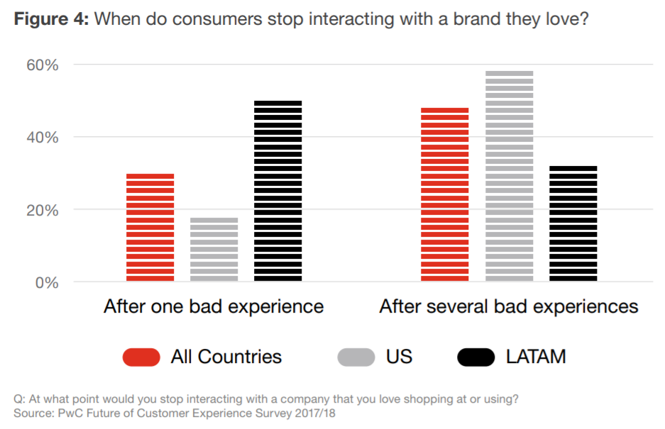
We often forget that customers are just as likely (if not more likely) to leave a brand because of poor experience as they are because of a value gap. According to PwC, one bad experience is enough to make a third of all customers stop doing business with a brand they love.
That’s why better UX design—both as a product strategy and as an attribute applied to your digital properties—can be such a powerful retention tool.
It places the user’s immediate needs and inclinations, rather than their financial value, at the center of their interactions with your product or service.
A better user experience reorients priorities around functionality, treats customers as active participants in products, and by the way, yields massive ROI.
A closer look at churn (and why UX design is the antidote)
A 2018 study by CallMiner estimates that U.S. businesses lose about $136 billion per year to “avoidable customer churn.” The problem is especially pronounced among subscription-based companies, which have quickly become the predominant model for technology products.
Here, success (and predictable revenue) depends entirely on customer loyalty. But with a dozen brands in line to compete in almost every category, and with over-hyped products that quickly lose their charm, customer loyalty is volatile.
Look no further than the cautionary tale of MoviePass, or the quick downturn of Blue Apron, the food delivery service whose stock price dropped 70 percent when the company went public in 2017.
People have even less tolerance in the software-as-a-service world, where many users churn before paying the first installment. According to Intercom, 40 to 60 percent never make it past the free trial.
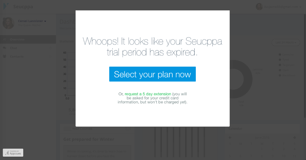 Source: Appcues | https://docs.appcues.com/article/144-trial-conversion
 What does all this have to do with user experience design?
Churn happens when customers lose faith in a brand or stop deriving value from a product and quit the relationship.
Short of shifting your entire business model or reinventing the nature of what your brand offers you’re left with the idea of making tweaks to your product.
In practical terms that means understanding where you’re going wrong. The best way to stop churn is to research the needs of your audience and optimize your product’s design and functionality to match their priorities.
That’s UX design. And that’s why every dollar invested in UX (invested wisely, mind you) can yield a $100 return on investment. In some ways, it’s your only option. But it’s a good option.
How optimizing your user experience can help
Reducing churn with better UX isn’t just about building pretty dashboards or injecting animation into static pages; it’s about a process.
With the right tools and the right skill set, you approach the churn problem from a different direction: instead of frantically convincing customers to sign up for more stuff, you focus on optimizing the value of the stuff itself.
These four examples illustrate how better user experience design can improve your retention rate:
1. By enriching your customer knowledge
A critical component of any UX strategy is collecting user feedback. In PwC’s study, 54% of US consumers said the experience at most companies needs improvement.
That’s pretty vague on its own, but getting feedback directly from customers will give you a clear line of sight into customers’ unmet needs or frustrations with the way your product is currently built.
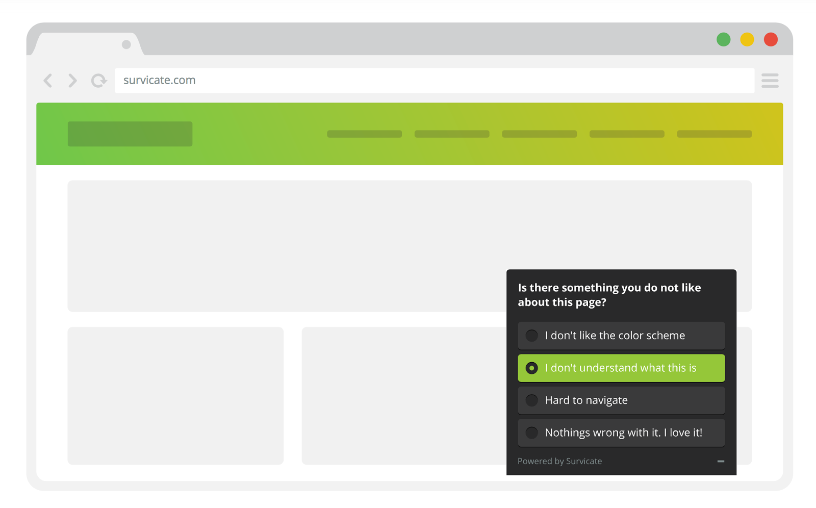 Credit: Lucjan Kierczak | https://developerblog.intercom.com/better-customer-feedback-with-survicate-intercom-cadc7be10b3e
The key is to collect feedback appropriately, depending on what you need to learn.
If you want to compare the behavioral impact of a step-by-step onboarding tutorial versus a single splash page with tips, you should collect qualitative feedback by running field tests with a prototype or recording digital sessions with a test group.
If you want to understand the preferences of your user population around a few specific areas, quantitative data from a survey might suffice.
The result of these various research techniques will be a greater understanding of how your audience navigates your product.
You’ll better understand how they complete tasks, the goals they’re trying to achieve, and where in the process you can make things easier for them.
2. By encouraging user input
This is like the banking example, but a lot more subtle, and a little less greedy.
It’s the same principle, but with a positive spin: the more invested in your product a customer becomes, the more value they perceive, and the less likely they are to bail.
The moment when users perceive the most value is called the “aha!” moment. Once someone experiences it, they’re much more likely to stay with your app.
But digital products don’t always do a good job of making onboarding experiences intuitive, or emphasizing why each interaction is important to users.
So people leave before the free trial expires because they don’t have any vested interest in staying. Either that or they just stop interacting—something we might call “behavioral churn.”
Case in point, most apps on the market lose 90 percent of their daily active users within the first 30 days. Rest assured that behavioral churn is almost always a precursor to customer churn.
An effective user experience employs visual cues and accessible copy to guide users into areas of the experience where they’re compelled to add something and experience some utility in return.
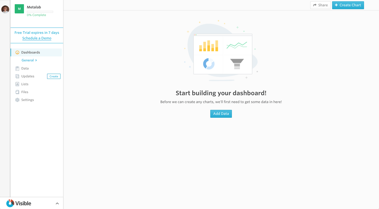
This should happen as soon as possible, starting with the user’s first experience. That’s why empty states are so valuable: they and convert new users into active participants and show people where the value is.
3. By strengthening the reward system
There’s a whole school of thought around making digital UIs addictive, and the premise is that UX design can strengthen effort and reward sequences in the brain that keep users coming back for more.
The ethics of addiction aside, there are practical ways to boost intrinsically motivated interaction.
The design tools at your disposal:
-
Colors
-
Badges
-
Imagery and illustration
-
Audio cues
-
Animation
-
Visual feedback
-
Spatial relationships
Through the right combination of these tactics, you can, to an extent, preclude people from giving up and keep them coming back to experience more variable rewards.
Progress bars are a perfect example. By showing the users a dynamic visual that represents their proximity to a goal, you can increase the level of effort exerted to reach that goal. The closer they get, the harder they try, a principle known as the Goal Gradient Effect.
 Source: Appcues | https://www.appcues.com/blog/the-5-best-user-onboarding-experiences
4. By motivating action
Regardless of what industry you work in or the type of product you offer, there are certain actions correlated with retention that you want customers to take. Maybe that’s adding more funds to a gift card, or maybe it’s utilizing certain product features within a certain space of time.
UX can be your secret weapon here—the way you bridge the gap between digital channels and customer actions that improve longevity and lifetime value.
The key is to operate with a strong grasp of the user journey. You don’t want to be pushy, of course, but every interaction a user has with your product should lead them, at some point, to a contextualized call to action, whether that’s a cross-sell/upsell attempt, human contact, content, or functional use of your product.
The more meaningful engagements, the higher the perceived value of your brand, and the higher your retention.
***
It should be obvious, but winning the battle against churn takes more than adding new features or product lines. Imagine a restaurant that makes delicious cuisine, but the menus are covered in slime, the wait is 45 minutes, and the servers never refill your water. Sure, you get to function, but the experience is disastrous.
If you want to see retention rates rise, you have to address usability in the context of the experience as a whole. You have to see “working on UX” as synonymous with “working on your product.”

Share on Facebook
Share on Twitter