
Zach Watson
In 1973, then-IBM president Thomas Watson Jr. posited “Good design is good for business. We are convinced good design can materially help a good product reach its full potential.”
Thanks to his influence, IBM shed its reputation as a company that dealt in punch cards and employed a roster of talented designers and architects to fashion itself as an enterprise that was both innovative and stylish.
Watson Jr. didn’t use the word strategy in his famous quote but realized his vision hinged on successfully planning the right moves and then making them.
This is the inflection point business leaders struggle to cope with. The body of evidence supporting the ROI of user experience design grows by the month, so the value of design is readily apparent.
The question has now become: “How do we plan and apply an effective UX strategy?”
There are a few different answers to that question, but Jaime Levy provides the best guidance with her 4 Tenets of UX Strategy. By analyzing each of these four tenets and showing real-world examples, I’ll outline how you can create a UX strategy that’s less wishful thinking and more get shit done.
The 4 pillars of UX strategy
Before we go any further, it’s probably important to do the obligatory “what is UX strategy” thing. By Levy’s definition, UX strategy is “a plan of action for how to ascertain that the user experience of a product is aligned with business objectives.”
So instead of hiring a bunch of UX designers and then wondering what they’re doing all the time, you can follow these guidelines and ensure the work of your design team is actually worth something to your business.
1. Business Strategy
A business strategy explains the foundations of your venture, like your
-
Competitive advantage
-
Business objectives
-
Revenue streams
If this seems like a weird place for user design to hang out, think again. All of the inputs in your business strategy directly influence your UX strategy. Unless you comprehensively understand your target market and competition, you can’t be sure that anyone will actually want what you’re building.
Are you going to create a healthcare platform for the elderly? Better not design anything too avante garde or complex.
Is your primary persona teenagers? You should really think about how you’re going to keep their attention and monetize your product (because they probably can’t pay for it).
What I particularly like about Levy’s model is her focus on your value proposition. By her definition a value prop is “a promise of value to be delivered and a belief from the customer that will be experienced.”
This is where things get real between your business strategy and your user experience. If you promise customers a certain value, then the experience of your product better deliver.
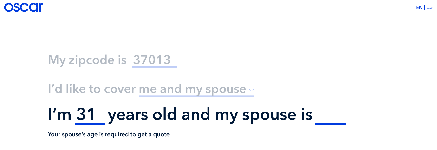
Take Oscar. These guys have raised over $1.3 billion on the back of a compelling value prop:
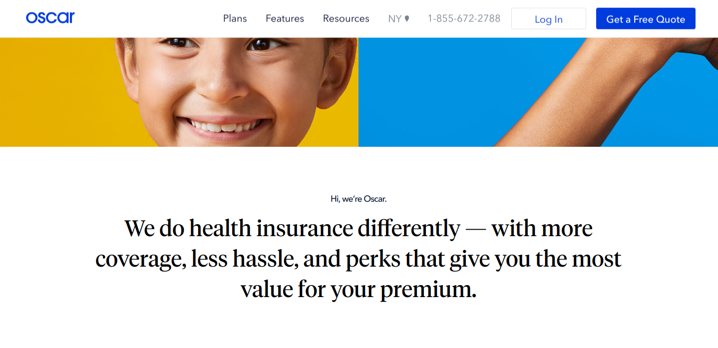
Promising to make healthcare insurance less terrible is a humongous promise. Thankfully, Oscar’s user experience delivers. You just answer a few short questions to see your coverage options.
The Story of PayPal, or how to pivot a business strategy
Another important concept of Levy’s UX strategy is that you have to be able to iterate and pivot your business strategy.
20 years after its inception, PayPal remains a shining example of a company that aligned its user experience with its business strategy. But it’s business strategy wasn’t always so good.
As the story goes, cofounders Peter Thiel and Max Levchin didn’t start the PayPal project as a way to transfer money. Instead, they were working on a library to encrypt various software that they could then license.
Turns out no one wanted to pay for that. But all was not lost. Thiel suggested they use the encryption library to power a money transfer service.
Now that was something people needed, a lot of people in fact.
At the same time Thiel and Levchin were pivoting PayPal, eBay was building a customer base. But people needed an easy way to pay for all the weird stuff they bought on eBay.
PayPal stepped in and became the default option. The rest is Silicon Valley history.
Now PayPal owns the lion's share of the e-payments market. All because they pivoted their business strategy and matched their user experience to their value prop.
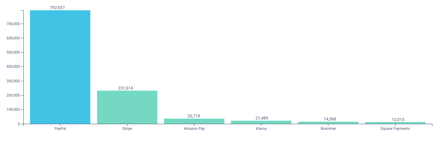 Source: Datanyze
 2. Value Innovation
If every decent product delivers some value to its users, then value innovation is the pursuit of a user experience that delivers so much utility it becomes essential to your audience.
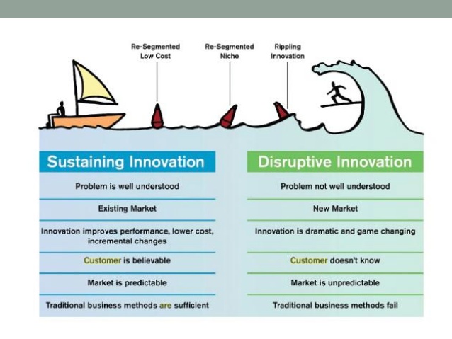
Now, there’s more than one path to becoming essential in your UX strategy. The Lean Entrepreneur divides innovation into two camps: sustaining and disruptive.
Sustaining innovation is the realm of established organizations in mature markets. These companies innovate by making incremental improvements to well-understood problems.
A slow march of innovation can still add significant value to people’s lives. Think about the evolution of car tech: backup cameras, automatic braking, and hands-free stereos all bring real utility to the table.
In contrast, disruptive innovation is, you know, disruptive, man. This approach attempts to deliver a type of value that’s not well understood by most people in markets that are not well-recognized.
Netflix and its streaming revolution come to mind.
Anyway, here’s a nice visualization of the two concepts:
Patreon and the innovation of idea brokers
In his book, Smarter Faster Better, Charles Duhigg examines the genesis of innovation. His research concludes that the vast majority of innovation is born from the reuse of old ideas in new scenarios.
Duhigg calls the masters of this practice idea brokers. These innovators meld different, sometimes disparate, ideas to arrive at something new.
That’s exactly what Patreon is doing by offering DIY digital creators a platform to receive money from supporters.
If Patreon only offered e-payments, then it would be just another tiny bar on that earlier chart next to PayPal. But Patreon combines the intuitive nature of e-payments with the scale of a membership service and the explosion of digital DIY content.
Instead of having to jump through digital hoops to support their favorite creators, fans can simply use Patreon to set up monthly contributions to online artists.
As Levy suggests, Patreon’s product is indispensable to its users. Over 3 million people use the site to support over 100,000 online creators. These creators depend on audience support through Patreon for their livelihood.
And the company’s founder expects Patreon to move upwards of half a billion to creators this year.
What’s notable is that Patreon manages to be innovative by virtue of cross-pollination. The idea of e-payments and membership sites already existed. Patreon just blended them to create an incredible user experience.
3. Validated User Research
Before you put anything into production, you have to do the user research. All four tenets of Levy’s UX strategy are worthwhile, but validating your product with actual users is the only one that can save you from pouring resources into something no one wants.
You have to gather input from your users and learn based on that input. Otherwise, you’re not doing UX design, and you’re not using the right data to guide your decisions.
Levy advises us to think of products as experiments that must be tested.
As I’ve written many times only on this blog, there are a myriad of ways to do user research. From generative and evaluative to qualitative and quantitative. If you’re looking for some guidelines, check out the research steps in our UX design process.
You need to do research early and often. If you want to be as lean as possible, get a prototype and test it with people who would actually use your product. They’ll tell you whether your product is viable.
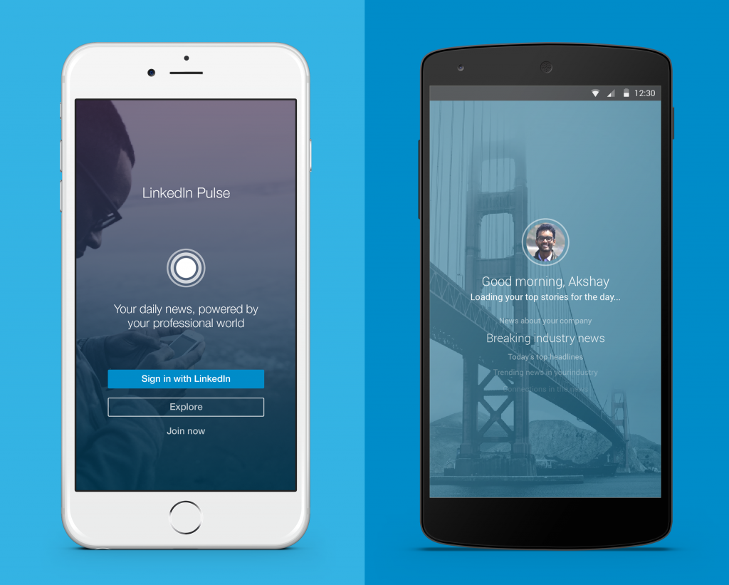
LinkedIn Pulse and the art of cafe prototyping
To get into the LaunchPad course of Stanford's prestige d.school, you have to pitch a business idea. After you got in, you had 10 weeks to build your business idea.
Two students, Akshay and Ankit, pitched a new aggregation app for the then-newly released iPad. They got into the class. And then they had four days to build a prototype.
So like any undergrad entrepreneurs, they took their idea to the campus cafe. There they had direct access to people who were imbibing caffeine and reading the news. This is where the fate of their product would be decided.
Starting with paper prototypes and progressively going digital, the pair gathered as much feedback as they could from their audience. Then they would take what they learned, iterate, and create a new version of the prototype.
The pace was breakneck, but the work paid off. Akshay and Ankit’s Pulse News app was so successful Steve Jobs showed it off at an Apple Developers Conference. LinkedIn bought the app for $90 million a few years later.
 LinkedIn Pulse became a $90 million product because of rapid prototyping and customer validation.
Here’s the moral of the story: do the research.
Even if your prototype sinks instead of swims, you’ll have the knowledge you need to pivot, which as we’ve seen with PayPal, can lead to much better outcomes.
4. Killer UX
The first three tenets of Levy’s UX strategy focus on doing the right thing. The final one advises you to do the thing right.
Once you’ve matched your value prop to your user experience, planned how to deliver new value, and tested the prototype with users, it’s time to build something badass.
The user experience extends to all corners of the product, but the best way to ensure you have stellar UX design is simply to focus on the key features of your product.
What are the primary functions around which everything else orbits? Those are the experiences that must be seamless.
Asana and the aesthetic usability principle
I know, I know. That last line is pretty abstract. The truth is there are a lot of UX principles that lead to a righteous user experience.
For this example, I’m going to the aesthetic beauty principle, particularly how it’s used in Asana.
If you don’t know, Asana is an excellent project management software. It’s dead simple for me to keep a running lists of tasks, make new additions to that list, and share them with other humans.
The negative space puts me at ease even when my inbox is being bombarded and most of my to-do list is red. What’s more, everything I need to do requires only one or two clicks.
I’m sure Asana isn’t the only project management tool that offers this type of experience.
But in my mind, it’s the most beautiful, which I know is a large part of why I perceive it to be so usable. The aesthetic usability principle explains that when people find an interface pleasing to look at, they innately think it’s more usable.
Asana has leveraged my bias for whitespace and pastels with one-click task completion to create an extraordinary experience. That’s how even in a saturated market like project management, Asana manages to be unique.
***
Levy’s four tenets of UX strategy aren’t for the faint of heart. But I would argue neither is building a successful, innovative product. There’s a lot of planning, testing, and iterating involved, and it takes discipline to embrace these ideas rather than expedite something to market.
But the payoff for devising a coherent UX strategy is immense. Quite often, it’s the difference between delivering something people will embrace for years to come or creating a product that’s destined to fizzle out in a few months.
Share on Facebook
Share on Twitter