


Zach Watson
The bylaws of the business world state that to scale, you must be consistent. Design is no different; design systems are the best tool for establishing consistency.
Design Systems Produce Consistent Results
Before you can sustainably expand your enterprise, you must be able to expect a certain type of outcome. This requires building systems and processes that produce consistent results.
Without a design system to set standards for every customer interaction, the consistency of your product or products breaks down.
Inconsistency is harmful for several reasons
1: Your brand will lose consistency across the user experience, and its identity will become less concrete to your audience. As your organization grows, designs will drift and vary based on personal preferences or current design trends, which adds further inconsistency.
2: Design and development slow down due to a lack of reusable assets.
3: Onboarding new team members becomes a slow, tortuous process.
4: Usability decreases as the UX changes across your product, which lowers retention and satisfaction while potentially raising support costs.
Thankfully, there is a way you can avoid this fate: Build a well-crafted design system.
That’s the destiny leading design companies like Apple, Airbnb, and IBM have chosen. Now you can too.
So, What Is a Design System?
A design system is a repository of all the design components for a given product or group of products and the documentation, frontend code sets, styles and standards, and principles that govern their application.
The fundamental idea behind a design system is that digital consistency is best achieved by breaking design into modular, reusable parts. These parts are then cataloged in a central location, along with instructions for how and why to use them.
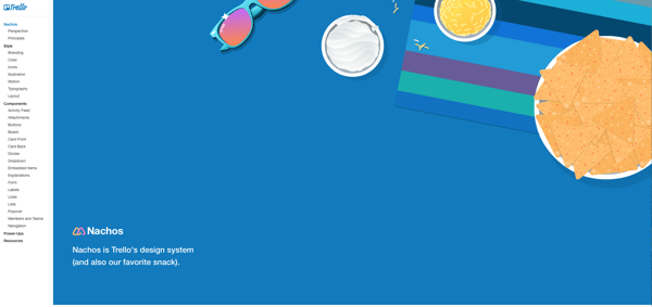
For example, here's the front page of Trello's design system.
Thus, when new projects arise, the design process is infinitely simpler. The product’s major visual elements are easily accessible, and the standards for implementation are well-defined.
Instead of starting from scratch, designers and developers only choose the pieces they need and assemble them as needed.
It’s important to remember that design systems must be ever-changing. Instead of stagnating like artifacts, design systems evolve to reflect the most current version of your product.
These systems act as a repository for approved designs, making them tools for productivity and the source of truth for your team.
What Needs to Be in a Design System?
Before we move on, we have to make a public service announcement.
We’ve had clients ask us to build them a design system only to learn halfway through the project that they don’t like any version of their product’s current design.
You need a design your stakeholders and users agree is great and worthy of scale. If you’re unhappy with the current design of your product or internal applications (whichever you plan on applying a design system to), you need to redesign the UX and UI first, which is a completely different process.
I digress...
At the time of writing, there remains some ambiguity in the industry regarding how people describe design systems and what they believe constitutes a viable system. And fair enough. The market is still testing what is most effective, and debate has to occur for us all to arrive at the best answers. Fortunately for us (and our readers), our team has much first-hand experience to call on about what works and what does not, as best we can tell.
This is how we explain the concept to our clients and partners...
Design systems typically include Governance, Style Guidelines, and a Pattern Library.
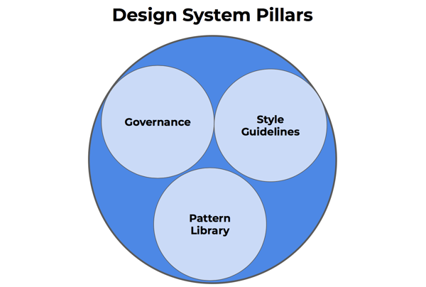
Governance refers to the policies and philosophy guiding your product or portfolio design. Governance clarifies why components are used in a specific way.
Style Guidelines outline the standards for your product’s branding and design. Icons, typography, and color palette are common examples.
A Pattern Library catalogs each UI element from your product so designers can quickly access and reuse it. Related elements are often combined and displayed as layouts. Relevant HTML, CSS, and Javascript code is also often included.
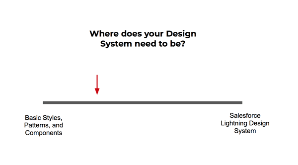
The Design System Spectrum
Despite the term's growing popularity, there’s little consensus about what constitutes a design system.
This ambiguity makes it difficult for organizations to determine how to begin building their system or what a functioning system should look like.
Should you build an endless library or keep things lean and light?
In our experience, we’ve seen both types of design systems succeed. The approach we recommend varies depending on your organization's size, your product portfolio, and how often you onboard new designers and developers.
Let’s look at examples on both ends of the spectrum more closely for clarity.
The “Minimum Viable” Design System
If you want to keep your design system lean, consider the minimum amount of work to put in that will create enough value in return, i.e., increase consistency and reduce redundancy.
This is unique to the services we offer at DePalma, but often, our clients also have budgets and timelines to consider when working with us to build out their systems. We usually start the conversation by showing the minimum we recommend including in a design system to make an impact worth the investment.
Our minimum viable design system includes a style section and a pattern library showing images of the components and patterns used. We also always recommend this be hosted in a browser instead of making a PDF to avoid versioning headaches.
From here, the depth of your design system comes from deciding which areas of governance you want to define within the system and how much detail to include in your style guide and pattern library.
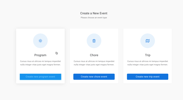
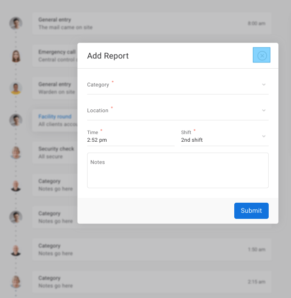
To give you a better idea of what components and layout examples look like, here are some screenshots from a lightweight design system we built for a client:
The Enterprise Design System
In the other corner is the heavyweight champion of the world, the enterprise design system. A design system of this size has more responsibility than a minimally viable version because it has to provide consistency across more products, designs, and team members.
For example, it’s not unusual for an enterprise to have a product portfolio, so the design system must guide a greater number of scenarios.
In addition to breaking down the visual aspects of a product into individual components, an enterprise design system will include the corresponding code developers need to implement each element.
Typically, the reusable code is made up of JavaScript, HTML, or CSS flavors. Supplying developers with ready-made snippets of code reduces the decisions they must make during implementation, thereby increasing their efficiency and productivity.
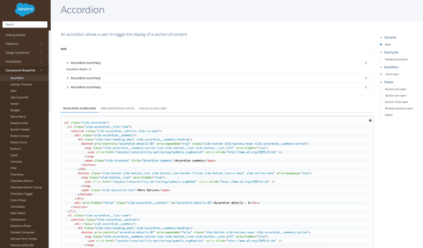
Here’s an example from Salesforce’s design system:
Naturally, a resource of this scope takes a lot of work to build, but the efficiencies it creates are significant.
Just consider the hours saved by preventing multiple teams of developers and designers from having to create new solutions every time they implement a design or new code.
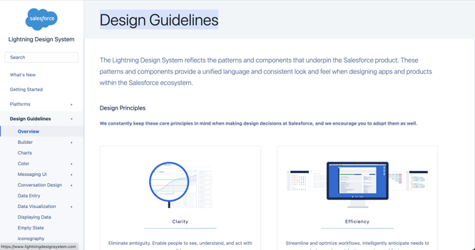
The Salesforce Lightning Design System is a prime example of an enterprise design system.
Your design system can fall anywhere on the spectrum:
 If you're interested in more information about Lightning Design Systems, check out our blog post on how to build a lightning design system which goes into more detail.
So, you’re ready to build a design system that can help you reduce redundant work and speed up the design and development process?
How Do I Build a Design System?
So, you’re ready to build a design system that can help you reduce redundant work and speed up the design and development process?
Excellent choice. Here’s the three-step process we use to build design systems at DePalma.
Pillar 1: Governance - Plan Your Design Principles and Policies
The most valuable part of a design system is not the never-ending library of components or the ready-made catalog of code. It’s the clarity of established design principles and policies.
Ambiguity and chaos are a design system’s mortal enemies.
To effectively combat them, a full-grown design system must include principles that help designers and developers understand how to utilize the components on hand and why they should be used that way.
Here’s how Trello lays out its principles in its incredibly named Nachos design system:
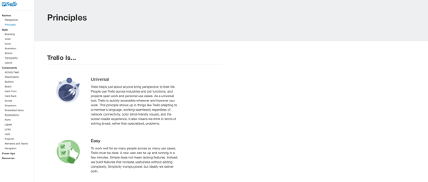
Principles can range from accessibility to copywriting. Here’s a list of things to consider when defining your principles:
- What considerations do your design team need to remember during implementation?
- How are these values unique to your brand?
- How does your philosophy affect content and copy?
- What benefits do these principles confer to users?
Pillar 2: Style Guidelines - Define Your Brand’s Style Guide
Although a style guide isn’t a standalone design system, it’s still an important pillar.
Here’s how Lonely Planet lays out its style guide in its Rizzo design system:
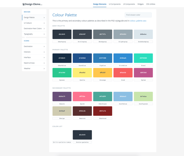
Here are the most important instructions to include in your style guide:
- Icons and Logos
- Motions / Animation Styles
- Color Palette
- Typography
- Image Repository
- Editorial Guidelines for Content
- Mobile Design Requirements & Breakpoints
Pillar 3: Pattern Library - Catalog Your Patterns and Components
Now, we arrive at the most detailed section of your design system. Adding patterns and components to your design system requires two broad initiatives:
1: Reducing your visual design down to individual interface elements (or its “legos” or “building blocks”)
2: Outlining conventions for how these components should be used in different scenarios, i.e., patterns, throughout your products.
Having these two aspects defined will help your designers and developers realize a lot of the benefits that make design systems so popular.
However, building this section of the design system requires you to make important choices about the depth of documentation and usability. Here are the main things to consider:
- Do you want to include code along with images of your components?
- What level of code do you want to document? Just the HTML and CSS, or would you like to include the Javascript?
- Do you want the code to be functional as part of the documentation? This means your design system will feature a demo-like version of the button next to your code that your devs and designers can see in action.
Obviously, this impacts the project's time, so you’ll need to weigh the cost-benefit.
Outliers and Edge Cases
There are, of course, outliers in the cohort of design systems made publicly available. Although these systems venture outside of what we recommend, that doesn’t mean we don’t appreciate them or that they’re not valuable.
Our opinion is that your design system is yours. Feel free to get creative with it and include anything you believe to be relevant to your team that will help them perform at a higher level.
Here are a couple of unique examples.
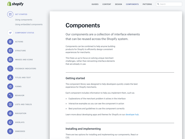
Shopify’s Polaris Design System has a component library that enables not only their internal teams but also third-party developers who are creating new applications for the platform,:
(Design systems for other large platforms will also include components and documentation for developers. Salesforce’s design system is another example.)
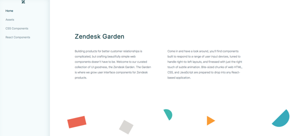
In a nod to minimalism, Zendesk’s Garden design system only has four navigation options: Home, Assets, CSS Components, and React Components.
The method we described for building a design system is one we’ve utilized for many clients in the past, and it’s helped them make leaps in bounds in both design efficiency and consistency across their products.
Whether you want to build something more creative or want a mechanism that helps keep the user experience of your products consistent, a design system is your best option.

Share on Facebook
Share on Twitter


