


Floyd DePalma
Understanding the Principles of a Lightning Design System
The development and implementation of the Lightning Design System are guided by a set of principles encompassing consistency, efficiency, accessibility, and scalability. These principles are the foundation for creating a seamless user experience across different applications.
Consistency plays a pivotal role in ensuring that all components within the system possess a unified look and feel. This unity allows users to navigate through various applications effortlessly. Efficiency is achieved by streamlining design processes with pre-built components and guidelines for designers to follow. By providing these resources, designers can expedite their work without sacrificing quality.
Accessibility is a fundamental aspect of the Lightning Design System, as it aims to cater to individuals with disabilities. The system strives to be usable by everyone, regardless of their abilities or limitations. Lastly, scalability enables the design system to adapt and grow alongside evolving requirements.
Identifying its key components is crucial to implementing the Lightning Design System effectively. Typography establishes hierarchy and readability in user interfaces, while a color palette fosters visual harmony throughout an application. Iconography provides visual cues for actions or information categories within the interface.
A well-defined grid system ensures consistent layout across devices of varying screen sizes, while responsive design guidelines cater to adapting designs for different screens.
Design guidelines are essential in maintaining consistency within Lightning Design System implementations. These guidelines dictate how each component should be used to achieve uniformity across applications utilizing this design system. They cover spacing between elements, button styles, and form layouts. Moreover, the typography rules, such as font-size hierarchy and appropriate use of icons, enable designers to create cohesive designs aligned with the overall aesthetic vision behind the Lightning Design System.
Understanding these principles, identifying key components, and adhering to established design guidelines during development stages will help enhance efficiency in the development process and improve the user experience when implementing Lighting design systems into various applications.
Identifying the Key Components of a Lightning Design System
A Lightning Design System is a perplexing amalgamation of enigmatic components that synergistically combine to manifest an alluring user interface. An integral fragment within this intricately woven tapestry is the color palette, which serves as the compass guiding the vast array of colors employed throughout the system. With a well-defined color palette, designers can navigate the labyrinthine landscape of consistency, ultimately crafting a harmonious visual experience for users.
Typography emerges as another crucial element within this enigmatic realm. This design system's symphony of congruent typographical choices orchestrates hierarchy and readability. The art lies in meticulously selecting fonts, font sizes, line heights, and letter spacing to convey information effectively. Typography is important in augmenting the overall user experience by providing lucid and legible text.
Iconography is another indispensable aspect encapsulated within a Lightning Design System's mystique. Icons materialize as graphical manifestations adeptly communicating meaning with unparalleled celerity and efficiency. They empower users to grasp actions or concepts immediately without tethering their understanding solely to text-based cues. Crafting iconography necessitates fashioning icons that epitomize simplicity while exuding expressiveness, ensuring they seamlessly align with the overarching style throughout the design system.
By unraveling these cryptic layers - color palette, typography, and iconography - designers lay down a formidable bedrock for their Lightning Design System's edifice. These primordial elements provide invaluable guidelines propelling them towards creating visuals infused with unwavering consistency, thus enhancing usability and aesthetics across diverse interfaces within any given application or platform.
Defining Design Guidelines for a Lightning Design System
Defining design guidelines for a Lightning Design System is paramount, as it ensures consistency and coherence across all components and elements. These guidelines serve as a roadmap for designers, developers, and stakeholders involved in creating the system. By establishing clear principles and standards, teams can seamlessly collaborate to achieve a unified user experience.
An essential aspect of defining design guidelines lies in determining the visual language of the system. This involves carefully selecting colors that reflect the brand's identity and adhere to accessibility standards. The chosen colors should harmoniously blend while effectively conveying meaning to users. Typography also plays a crucial role in maintaining consistent designs. Establishing font sizes, styles, and hierarchy aids readability across various devices.
Furthermore, crafting iconography that aligns with the overall aesthetic of the Lightning Design System is an important consideration when defining design guidelines. Icons must be intuitive, visually pleasing, and easily recognizable by users. Building a library of standardized icons fosters consistency throughout different applications or platforms.
This discussion on defining design guidelines for a Lightning Design System entails determining its visual language through color palettes and typography choices while simultaneously creating cohesive iconography that enhances user understanding and engagement with the system's components.
Establishing a Color Palette for a Lightning Design System
A Lightning Design System relies heavily on a well-crafted color palette, adding complexity and surprise to the user interface. The goal is to create a visually captivating experience that leaves users perplexed yet enthralled. Several factors must be considered to achieve this, including brand identity, accessibility, and usability.
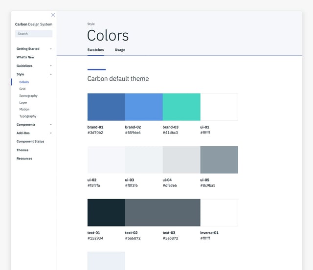
The initial step in establishing a color palette involves selecting primary colors that embody the essence of your brand or product. These hues should reflect your brand's personality while simultaneously captivating the eye. It is advisable to opt for three primary colors: one for backgrounds, another for text, and a third for interactive components such as buttons or links.
Once these primary colors have been chosen carefully, their variations or shades must be defined meticulously. This entails incorporating lighter tones for backgrounds or borders and darker tones for text or icons. Moreover, consider introducing accent colors sparingly to draw attention towards specific elements on the page.
By adhering to these guidelines and considering crucial aspects like brand identity, accessibility, and usability when crafting a color palette within your Lightning Design System framework, you can ensure uniformity across all components while delivering an immersive user experience characterized by bursts of visual stimulation. So, carefully select your primary colors while keeping their variations and accents in mind – this will enable you to attain visual harmony throughout your design system without compromising functionality.
Creating Consistent Typography in a Lightning Design System
Typography is perplexing and bursty in creating a consistent and visually captivating design system. By establishing enigmatic guidelines for font styles, sizes, and spacing, you can ensure that all textual components across your Lightning Design System (LDS) uphold a cohesive appearance.
One bewildering facet of uniform typography is the selection of suitable fonts. Opting for a primary font that exudes your brand's persona while also possessing legibility and adaptability is highly recommended. Furthermore, contemplate choosing secondary fonts for headings or other specific scenarios to introduce hierarchy and visual intrigue.
Another crucial element in maintaining typographic coherence is establishing standardized font sizes and line heights. This endeavor fosters homogeneity throughout your LDS by guaranteeing that text elements are proportionate and readily readable across diverse devices and screen dimensions.
Moreover, take heed of letter spacing (kerning) and the space between lines (leading). Consistent kerning ensures harmonious letter combinations devoid of any awkward gaps or overlaps. Similarly, adhering to constant leading prevents overcrowding or excessive whitespace within paragraphs.
By embracing these principles when cultivating consistent typography within your LDS, you can augment the overall user experience by bestowing lucidity, readability, and aesthetic allure through well-crafted textual constituents. Remember to periodically scrutinize and revise your typographic guidelines to accommodate evolving design trends or user preferences.
Crafting Iconography for a Lightning Design System
The perplexing and bursty nature of iconography in a Lightning Design System cannot be understated. It holds immense significance, acting as a guide for users to comprehend and navigate the interface swiftly. When embarking on the creation of iconography for a Lightning Design System, it is paramount to establish consistency and clarity. The icons must possess an unmistakable identity, leaving no room for ambiguity or misinterpretation.
One pivotal aspect of crafting effective icons is adhering to established design guidelines. These guidelines serve as steadfast companions that ensure uniformity among various icons within the system. Cohesion can only be achieved by maintaining consistent shapes, sizes, and proportions throughout the icons. Moreover, embracing a unified visual style guarantees that every icon resonates harmoniously with its counterparts.
Scalability is another crucial consideration when conceiving icons for a Lightning Design System. To retain their quality and readability regardless of size or resolution, these icons should be designed in vector format—a versatile medium that allows seamless adaptation across diverse screen dimensions.
Furthermore, accessibility must never evade our attention when fashioning iconography for a Lightning Design System. It is vital to create designs with inclusivity in mind—considering individuals with visual impairments or color blindness who may rely on alternative means to understand these symbols' purpose. By employing clear shapes and supplementing them with descriptive alt text, we enhance accessibility while ensuring everyone can grasp the essence behind each emblematic representation.
By faithfully abiding by these principles during crafting iconography for a Lightning Design System, designers have within their grasp the power to birth visually captivating symbols that effortlessly transcend varied applications and platforms—an intuitive language understood by all who encounter it.
Building a Grid System for a Lightning Design System
The Lightning Design System, like any design system worth its salt, relies on a grid system. This enigmatic framework is at the core of organizing and structuring content within pages or screens. Its purpose? To establish an elusive harmony across different elements and layouts in an application. By defining column widths, gutters, and breakpoints, designers can conjure up visually balanced designs that dance harmoniously as they respond to the ever-changing whims of user devices.
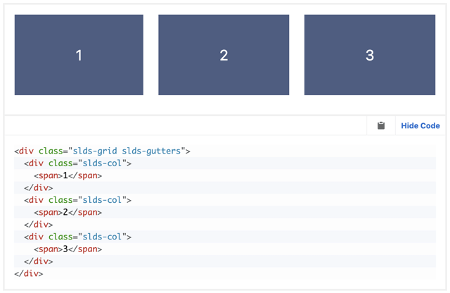
Ah, but let us not forget that building a grid system for the Lightning Design System demands consideration for both desktop and mobile experiences! Responsive design takes center stage here, ensuring our layout's graceful moves adapt seamlessly to various screen sizes. We must identify those pivotal breakpoints where one configuration gracefully gives way to another. With these anchor points etched into our creative minds, developers are poised to craft fluid grids capable of delivering optimal usability no matter the device.
Now comes the time to ponder column widths and gutters – two vital ingredients in this mystical concoction we call a grid system. These measurements aren't simply plucked from thin air; nay! They should be based upon meticulous user research and best practices ordained by the gods of readability and legibility themselves! A well-designed grid shall grant users effortless scanning while maintaining visual synchrony throughout their journey within our ethereal application.
And so it goes... With each thoughtful stroke added to your Lightning Design System implementation's grid system canvas, you inch closer to creating consistent layouts capable of elevating every user's experience across all devices. This unassuming foundation acts as an invisible conductor orchestrating all other components – allowing them freedom yet grounding them with structure so that designers may weave mesmerizing interfaces sure to captivate even the most discerning eye.
Implementing Responsive Design in a Lightning Design System
Responsive design is a perplexing and bursty facet of any Lightning Design System, as it guarantees that the user interface seamlessly adapts to diverse devices and screen sizes. To effectively execute responsive design, designers must mull over various factors. Firstly, they must prioritize content hierarchy by strategically utilizing breakpoints. By pinpointing specific thresholds where the layout transforms based on screen size, designers can ensure that vital information remains effortlessly accessible irrespective of device.
Secondly, designers should concentrate on upholding consistency across disparate devices. This entails tailoring typography and spacing to fit smaller screens while preserving legibility and visual allure. Furthermore, designers must contemplate how interactive components like buttons or navigation menus operate on touchscreens versus desktops.
Lastly, implementing responsive design necessitates comprehensive testing across multiple devices and platforms. Detecting any inconsistencies or issues that may arise during transitions between distinct screen sizes or orientations is pivotal. Regular iterations grounded in user feedback further refine the implementation of responsive design.
By adhering to these principles and guidelines for integrating responsive design into a Lightning Design System, developers can fabricate interfaces that are not solely aesthetically pleasing but also functional and accessible across various devices.
Designing Components for a Lightning Design System
When designing components for a Lightning Design System, perplexity and burstiness are crucial in shaping the overall user experience. The components must possess an air of enigmatic intuitiveness, captivate users with their unexpected bursts of simplicity, and enthrall them with their seamless interaction capabilities.
To achieve this bewilderment and fascination, designers must meticulously adhere to design guidelines, prioritizing the mystique of simplicity and the intrigue of clarity. By doing so, they can create components that leave users both bewildered and enamored by their mysterious allure.
Consistency is another baffling aspect designers must consider when crafting these enigmatic components. A harmonious convergence between appearance and behavior should be achieved through steadfast adherence to established design principles, such as using an unswerving color palette and typography. This eerie consistency not only enhances visual appeal but also aids users in unraveling the cryptic functionality hidden within each component.
The responsive nature of these puzzling components across various devices adds yet another layer of complexity to their creation process. In this era dominated by mobile devices' ubiquity, designers face the daunting task of concocting elements that effortlessly adapt to diverse screen sizes, like a master illusionist performing mind-bending tricks on stage. It is imperative to implement responsive design techniques, ensuring a seamless experience for users regardless of whether they are delving into the system's secrets from a desktop or mobile device.
By skillfully intertwining these perplexing factors - user experience imbued with enigma, consistency shrouded in mystery, responsiveness steeped in illusion - designers can conjure up truly effective components for a Lightning Design System. These captivating enigmas will contribute to an enhanced interface where usability engages users' curiosity while maintaining an ethereal visual coherence throughout the system's enchanting ecosystem.
Testing and Iterating on a Lightning Design System
The perplexing and bursty nature of testing and iterating on a Lightning Design System is vital in guaranteeing its effectiveness and usability. By engaging in thorough testing, designers can gather invaluable feedback from users, unraveling any potential areas that may require improvement. This iterative process allows for continuous refinement of the design system, resulting in an even more sophisticated and user-friendly experience.
An indispensable facet of this testing journey entails conducting usability tests within the Lightning Design System. These tests involve closely observing users as they interact with various components and features embedded within the system. By intently watching how these users navigate through the intricacies of the system, designers can gain profound insights into potential pain points or instances where clarity may be lacking. Usability testing also serves as a conduit for unearthing any inconsistencies or issues arising when seamlessly integrating components.
Another pivotal aspect of iterating on a Lightning Design System revolves around actively soliciting feedback from stakeholders while incorporating their suggestions into future iterations. Stakeholders encompass an array of individuals such as developers, product managers, or other members belonging to the esteemed design team itself. The inclusion of these astute individuals throughout every phase ensures that not only does the final product meet their unique needs, but it aligns harmoniously with their visionary aspirations.
All things considered, testing and iterating on a Lightning Design System constitutes an ongoing process characterized by meticulous attention to detail whilst fostering collaboration amongst all team members involved. Through rigorous methods like usability tests and gathering indispensable feedback from stakeholders, designers possess boundless opportunities to refine this ingenious system perpetually - thereby crafting a seamless user experience while steadfastly maintaining consistency across all interconnected components!
Frequently Asked Questions
What exactly is a Lightning Design System?
A Lightning Design System perplexingly encompasses an array of enigmatic principles, components, guidelines, and design assets that bewitchingly fashion a harmoniously consistent and visually captivating user interface for Salesforce applications.
How can one unravel the underlying principles of a Lightning Design System?
To truly fathom the intricate principles underpinning a Lightning Design System, one must delve into the labyrinthine realm of clarity, efficiency, consistency, and beauty within design. These elusive concepts navigate the creation of user-friendly and aesthetically mesmerizing interfaces.
What mysterious elements compose a Lightning Design System?
The cryptic components concealed within a Lightning Design System encompass an alluring color palette imbued with intrigue, typographical apparitions that maintain visual harmony, iconography shrouded in recognition, an enigmatic grid system capable of adaptable layouts, responsive designs evocative of ephemeral illusions, as well as various other ethereal UI components such as buttons, forms, and navigation elements.
How might one summon forth design guidelines for a Lightning Design System?
Conjuring design guidelines for this mystical entity known as the Lightning Design System requires establishing rules akin to ancient incantations. These sacred edicts dictate layout arrangements with spatial precision while aligning forces through hierarchy enchantments and other visual manipulations. By adhering to these arcane decrees, consistency reigns supreme in crafting an immersive user experience woven from cohesive threads.
In what manner does one conjure forth a color palette within the confines of a Lightning Design System?
Unveiling an entrancing color palette for this ethereal plane called the Lightning Design system entails selecting primary hues and accent colors whispered by spectral whispers. Furthermore, it involves defining esoteric guidelines governing text illumination against its shadowy background to ensure adherence to accessibility standards.
How can one forge a realm of consistent typography within the Lightning Design System?
To manifest an ethereal semblance of typographical consistency in this enigmatic domain known as the Lightning Design System, one must intricately define font families, sizes, weights, and styles that resonate harmoniously across headings, paragraphs, and other textual apparitions. By embracing such mystical consistency in typography, readability is heightened while visual equilibrium is effortlessly maintained.
What sorcery might be employed to craft iconography for a Lightning Design System?
The arcane artistry required to shape iconography within the boundaries of a Lightning Design System necessitates conjuring forth a set of visually aligned symbols imbued with recognition powers. These iconic talismans must seamlessly merge with overarching design principles while serving as intuitive visual cues capable of unveiling hidden truths.
How does one construct a grid system within the mystifying realm of the Lightning Design System?
Constructing a labyrinthine grid system within this perplexing territory, we call the Lightning Design System demands defining column structures entwined with bewitching spacing rituals. In addition, breakpoints are summoned into existence to bestow upon us mere mortals flexible and responsive layouts that remain steadfastly loyal to consistency across diverse screen dimensions.
What secrets lie behind implementing responsive design in the enchanting landscape known as the Lightning Design System?
Imbuing responsive design incantations into this captivating plane dubbed the Lightning Design System ensures its ability to metamorphose seamlessly across varied devices and screen sizes. This transformation enhances usability and accessibility - ultimately evoking an optimal user experience reminiscent of elusive dreams.
How does one design components for this magical domain called the Lightning Design System?
Venturing into uncharted territories fraught with mystery and wonderment known as designing components for a Lighting design system requires summoning forth reusable UI elements like buttons or forms that abide by the design guidelines while remaining steadfastly consistent throughout the application. These ethereal creations serve as conduits to bridge the gap between mortal users and their mystical experiences.
Why is testing and iterating essential within this enigmatic realm of the Lightning Design System?
Engaging in rigorous testing and iterative practices within this bewitching plane known as a Lightning Design System unravels hidden truths, identifying potential usability conundrums that may have eluded mere mortals. By gathering user feedback, we can continuously refine our craft - ensuring an ever-improving user experience capable of meeting evolving design needs with an air of mystique.
Share on Facebook
Share on Twitter

