


Floyd DePalma
Have you ever walked into a toy store and marveled at the building blocks aisle, relating it to the “component library vs design system” debate? Each box promises a world of possibilities – cars, houses, castles. Now imagine those same boxes labeled as component libraries, each block an interactive element ready to assemble your digital product’s user interface (UI). But what if you need more than just blocks? What if you require instructions, design principles, even color hex codes for consistency?
Welcome to the expansive realm of design systems. A universe beyond simple building blocks that equips designers with guidelines and code snippets ensuring consistent experience across platforms.
In this journey through the intricate labyrinth of component library vs design system, we will unlock doors leading toward understanding their unique structures, the benefits they bring in creating seamless UI designs, and how these two interact within the larger ecosystem of digital product development.
Why might you inquire about this?
Table Of Contents:
- Understanding Component Libraries and Design Systems
- Exploring Component Libraries
- Benefits of Component Libraries
- Understanding Design Systems
- Comparing Component Libraries and Design Systems
- Implementing Component Libraries and Design Systems in Product Development
- FAQs about Component Library vs Design System
- Conclusion
Understanding Component Libraries and Design Systems
In the UI/UX design world, component libraries and design systems are fundamental. They both serve as a solid foundation for building digital products with consistency. What do these terms signify? Let’s break it down.
The Role of Components in a Design System
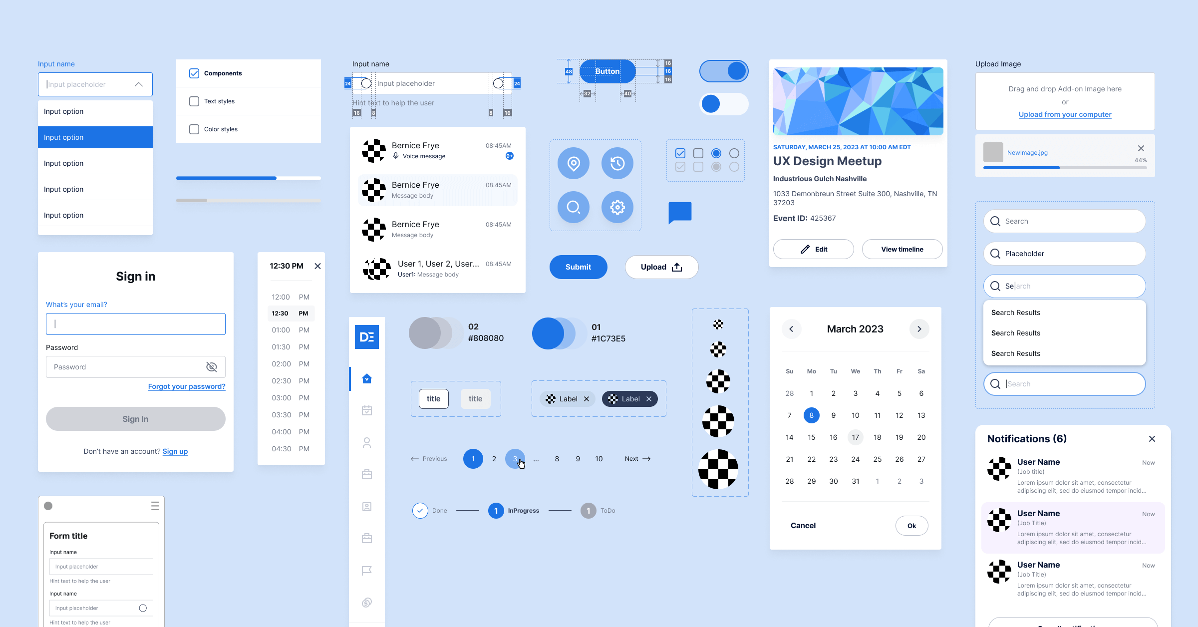
At its core, a component library is like an artist’s paint palette. It contains reusable blocks of code—think buttons or sliders—that can stand alone or form part of multiple UI patterns, like individual colors on a painter’s palette that combine to create various designs.
Atlassian’s design system and Shopify’s Polaris are prime examples where components play pivotal roles. Each element has been carefully crafted to ensure consistent user experience across their products—a crucial aspect when you’re aiming for scalable digital solutions.
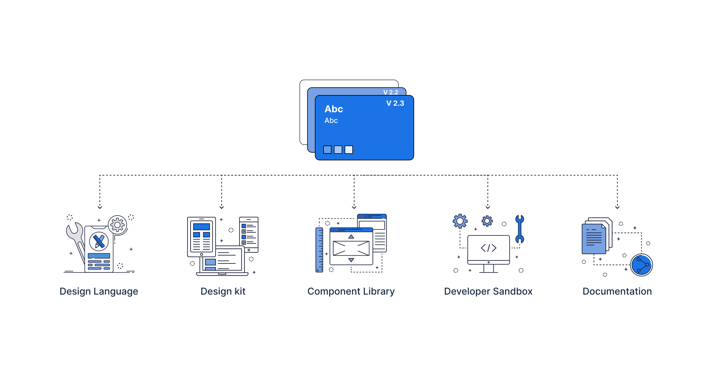
Moving on to design systems, imagine them as more than just the paint palette—the entire art studio. A comprehensive set comprises brand guidelines (the artistic style), accessibility guidelines (ensuring everyone can appreciate your work), and governance protocols (rules about how things should be done) along with those key elements from our ‘paint box’, i.e., component libraries.
This way, we see that while there might be overlaps between component libraries and design systems—the latter is all-encompassing—it incorporates everything designers need right from the ideation stage through final product development.
This ensures harmony within teams and gives end-users a cohesive feel regardless of whether they interact with one feature or switch between different parts of your software application.
Exploring Component Libraries
When constructing a digital product for mobile or web, having an organized set of UI elements can give you a competitive edge. This is where component libraries come into play.
A UI kit, often seen in comprehensive component libraries like Material UI for React components, is the repository of reusable building blocks that comprise the user interface. Each design element—buttons, checkboxes, sliders—is pre-designed and coded to ensure consistency across different projects.
Atomic Design Methodology
In structuring our component library at DePalma Studios, we take inspiration from atomic design methodology. But what does this mean in practice?
In atomic design methodology—as proposed by Brad Frost—we think of our designs in terms of atoms (like HTML tags), molecules (simple combinations like form labels with their respective input fields), organisms (a more complex variety of molecules), and templates which bring these pieces together to create meaningful interfaces.
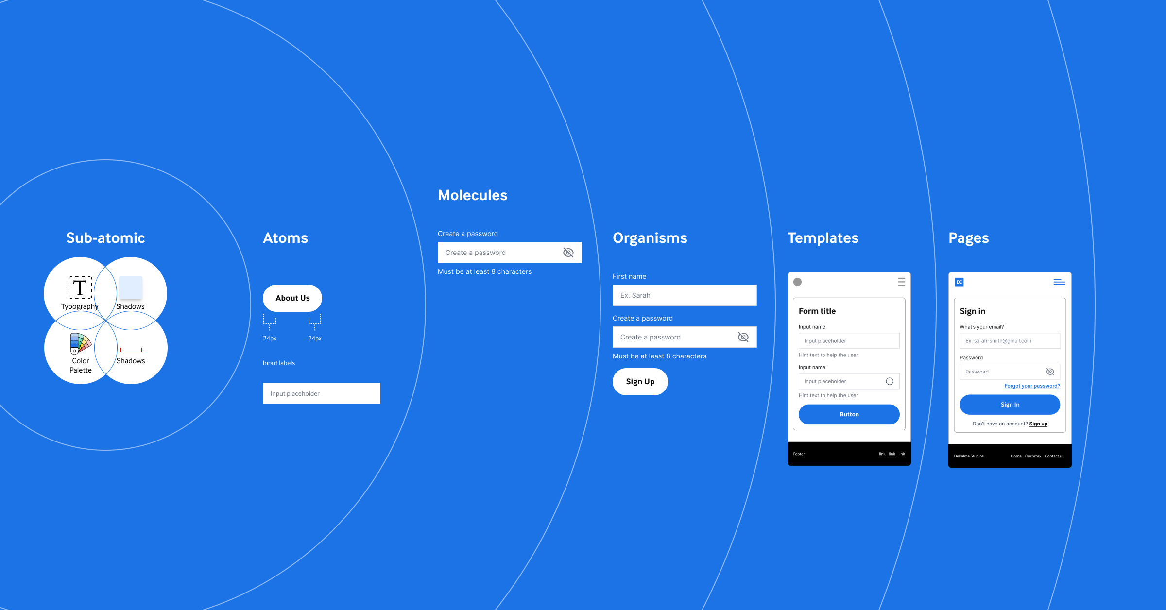
This approach helps us maintain a hierarchical structure within our pattern libraries, ensuring that all parts work harmoniously toward creating an engaging user experience.
The benefits are clear: improved collaboration among team members due to shared use, more consistent UI because everyone draws from the same well, and faster development times since there’s no need to reinvent each element whenever you start something new.
“Design systems incorporate everything designers and developers need to build…components are reusable blocks…” – Atlassian Design Team Member.
Atlassian’s own design system offers insight into how large organizations manage style guides and other aspects related to cohesive brand presentation.
Benefits of Component Libraries
A component library is a toolbox filled with versatile library components for designers and developers. Like how a carpenter would reach into their toolbox for the right tool, digital product teams access design components for their projects. What are the advantages that come with utilizing a component library?
The first major benefit is time-saving. Atlassian’s design system, which includes an extensive component library, has been instrumental in helping their team build products faster by reusing code snippets rather than starting from scratch every time.
But it’s not just about speed – consistency plays a huge role too. Using familiar elements across different projects ensures a consistent user experience. Imagine being able to give your users familiarity as they navigate through different parts of your app or website because you’ve reused components – pretty neat, huh?
In addition to saving time and promoting consistency, component libraries can foster better team collaboration. Using the same set of building blocks (components) makes communication more effective and less prone to misunderstanding.
Finally, let’s talk about scalability. With well-defined UI components, scaling up becomes much easier as new features can be built using existing elements without reinventing the wheel each time.
- Saves Time: Having ready-to-use pieces at hand allows quicker project completion.
- Promotes Consistency: Repeated use creates familiar interfaces, resulting in smoother user journeys.
- Fosters Collaboration: Shared understanding amongst team members leads to improved efficiency.
- Eases Scalability: Growth gets simpler when there are established systems in place.
Understanding Design Systems
A design system is a comprehensive guide that helps to ensure consistency across digital products. It includes key elements such as brand guidelines, accessibility guidelines, and UI design guidelines.
A design system serves as the blueprint for creating cohesive user interfaces (UI). Think of it like building blocks: each block has its unique role but fits together with others to create something more significant.
The Role of Governance in a Design System
Governance plays an essential part in maintaining the integrity of your design system. It’s akin to having traffic rules – without them, there’d be chaos on our roads. Similarly, governance establishes best practices and ensures everyone adheres to them while using the design system.
This can include how components should be used or when new ones can be added. With good governance policies, you avoid turning your clean and organized library into a Wild West.
Design tokens, essential small individual pieces of style information such as color values or spacing units (think hex codes), play their part within this governed ecosystem. They make sure designs stay consistent by dictating specific aspects throughout all applications under one umbrella – similar to following a uniform dress code at school, ensuring unity amongst students despite different grades or classes they belong to.
Comparing Component Libraries and Design Systems
The UI/UX design realm often sees the terms ‘component libraries’ and ‘design systems’ used interchangeably. However, they are distinct entities with their unique characteristics.
A component library is like a toolbox filled with reusable code snippets known as components that you can use to build your digital product. It’s akin to having an assortment of Lego bricks ready for any creation.
A design system, however, is more than just the components; it also encompasses a set of regulations. Picture this: if we compare a design system to cooking dinner from scratch, our recipe (or guidelines) dictates how those ingredients (components) should harmonize harmoniously.
To clarify these definitions, take Atlassian’s design system, for example—it provides everything designers need to create consistent user experiences across their products. (source)
In contrast, Material UI, an open-source component library, helps developers build quickly by offering readily available React components.
Different Strokes For Different Folks
We know what you’re thinking – which one do I choose? Well…it depends.
- If your goal is consistency in branding or functionality across multiple platforms or projects – go with a full-blown design system.
- If you are focused solely on reusability within specific areas, such as user interface elements—then pick up that handy component library instead.
Implementing Component Libraries and Design Systems in Product Development
Let’s take a closer look at how product development benefits from implementing component libraries and design systems. Both play crucial roles, but they shine when used together to build consistent digital products.
Component libraries, like the open-source Material UI, offer reusable code snippets for building blocks of user interface (UI). They streamline the design process by ensuring that team members use common elements. This consistency leads to a unified mobile application user interface, enhancing the overall user experience.
The benefit of this approach is not just aesthetic. By utilizing pre-designed design components from these libraries, developers can significantly accelerate the development process—time better spent innovating or addressing other aspects of the product development cycle.
The Role of Design Systems
A step above component libraries are comprehensive design systems like those utilized by companies such as Atlassian and Shopify. These systems go beyond providing simple building blocks—they establish a complete design language for your digital product.
In addition to housing all sorts of components – buttons, form fields, color palettes with hex codes – a robust system also includes accessibility guidelines and principles around their usage. This empowers teams with the resources necessary to create high-quality designs consistently across different projects while maintaining brand integrity and inclusivity standards.
Making It Work Together
To implement both successfully in your organization requires some thoughtfulness about your specific needs—but it’s well worth it. A carefully chosen combination ensures uniformity across all interfaces whether you’re creating a website or mobile app—and gives rise to what we call ‘consistent users’ who appreciate familiar experiences wherever they interact with your brand.
FAQs about Component Library vs Design System

What is a component library?
At its core, a component library is like an artist’s paint palette. It contains reusable blocks of code.
What is the difference between atomic design and component library?
Atomic Design refers to breaking down designs into basic parts—atoms, molecules, organisms. A component library uses these principles but focuses on ready-to-use components.
What is a component library in UX design?
In UX design, a component library offers predefined interface elements that help maintain visual consistency while speeding up development.
Are Component Libraries Worth It?
Absolutely. They save time by offering reusable UI pieces and promote consistent user experience throughout all products or pages within an organization’s digital footprint.
Conclusion
Mastering the intricacies of a component library vs a design system is like unlocking the blueprint to build effective digital products. These two serve as game changers in UI/UX design.
Remember, a component library serves as your toolkit for interactive elements. It’s about efficiency and reusability, ensuring design consistency while saving precious time.
The design system goes deeper. It provides comprehensive guidelines, including accessibility standards, color palettes, code snippets – everything needed to create a seamless user experience.
You’ve got this! With an understanding of these powerful tools under your belt, creating compelling and consistent UIs becomes more achievable than ever before.
Share on Facebook
Share on Twitter


