

Lexie Lu
There is nothing more important than the landing page of your website, particularly when it’s selling your core product or service.
It is the very first thing that visitors will see, and it can make or break their initial experience. It also sets the stage for everything else they will encounter on your site.
Most new users will stick around for a max of 15 seconds. So, it’s extremely important that you optimize the landing page, not just to boost engagement but also to ensure your users are having a great experience.
Despite all of this, a surprising number of websites and landing pages do the exact opposite, hindering users instead of helping them. To understand why it’s essential, let’s first define what a landing page is and what it should do.
What is a landing page?
A landing page is a dedicated web page designed for a specific purpose like promoting a product, generating leads, or encouraging newsletter signups. They are sometimes called squeeze or splash pages, which are just marketing or design lingo for the same type of page.
The ultimate goal is to collect data from users or leads by convincing them to fill out a form. If you’re promoting a product, for example, you might ask visitors for their email addresses or contact information so you can send them more information or future updates about said product.
Some mistake the term “landing page” to mean the front page of a website, but that’s not true — the front page is the homepage, and it serves a different purpose. You could make a landing page your front page if that’s how you design your site, but that’s generally not the case. It is one full page dedicated to whatever goal you are trying to achieve.
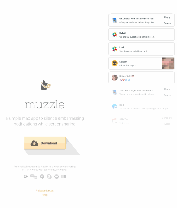
Muzzle's homepage is a rare exception.
Looking at a landing page as a single, standalone portal, you can see where the optimization comes into play. It is what you will use to encourage or communicate with your audience, and it’s your one-shot to gather the information you need. Fail to captivate your audience, and they’re going to leave.
Four Things Lots of Landing Pages Get Wrong
When it comes to boosting conversions or leads, it’s not just about marketing. It’s also about the entire experience from the time they load the page to the time they’re finished and leave.
If the page takes too long to load, people will get frustrated and bail. If the colors, style or visuals are unattractive, that’s also going to reduce your engagement. If your visitors can’t interact with text entry fields, click buttons or menus and have a tough time reading the text because of quirky fonts, your conversion numbers are almost certainly going to be mediocre.
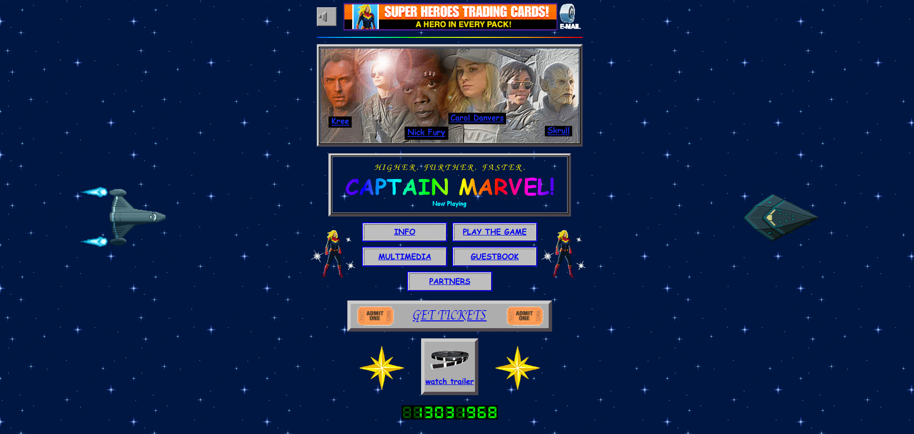
The 90’s inspired website for Captain Marvel was a brilliant piece of throwback marketing, but it also illustrates just how far landing pages have come. The page is nostalgic, because it’s so terrible.
These days, people have much higher expectations for their landing pages, so if you want to your splash page to product, there are some common mistakes to avoid.
1. No One Knows What You’re Offering
Your landing page exists for a reason. You are trying to accomplish something. What is it? Be clear with your audience, and explain what they will be getting in return for filling out your form.
A user should be able to see exactly what you’re offering within five seconds. If it takes longer, then you’ve failed. A lot of designs screw this up by including the call to action way down at the bottom of the page. If users have to scroll to see what you’re offering and why it matters to them, that’s poor design.
Of course, that doesn’t mean you should cram everything right at the top of the page. The page would be too cluttered.
How to Fix It
Place the most important information right up front, including your CTA. The value proposition should be front and center, visible to everyone, as soon as the page loads.
.jpg?width=750&name=h.o.%20penn%20machinery%20(1).jpg)
H.O.Penn Machinery does an amazing job of this. Notice how they included everything their audience needs right away. No one has to do any investigating to find out what this company is selling.
2. The Page Takes Too Long To Load
Longer loading times are always bad. In fact, if a page takes longer than three seconds to load, you’re going to lose tons of potential leads.
How to Fix It
Optimizing the UX of your landing page means making sure the page loads quickly. Be sure it loads not just on a desktop, but on mobile and all the different browsers your audience may use. Google’s PageSpeed Insights tool is excellent for measuring loading times.
Here are some things you can do to boost loading times:
-
Clean up your code and look for potential errors
-
Minimize redirects and fix broken links
-
Resize or compress images
-
Upgrade your hosting provider
-
Install a cache tool or subscribe to a service
-
Find a better theme — if you’re using a CMS like WordPress
3. There's Too Much Text
Don’t waste time communicating through text what you can with imagery. About 90 percent of information transmitted to the human brain is visual, anyway. We process images and visual content 60,000 times faster than text.
In fact, plastering your landing page with a wall of text is going to do no good anyway. It ties in with the first point — you must be able to show users what you’re offering within the first five seconds. If you’re asking visitors to sift through paragraph after paragraph of text just to understand what’s going on, they’re just not going to bother.
How to Fix It
Use visual content to boost the experience, provide more engaging insights, and keep everyone occupied and interested.
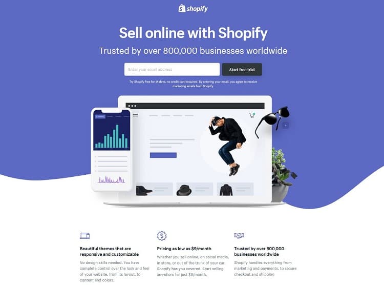
The Shopify free trial landing page does everything right when it comes to visuals. The on-page text is concise, the email field is right at the top, the headline tells you exactly what you get, and the visuals complement the entire design.
4. You Demand Too Much
The goal of the landing page is to gather data or collect information, right? So, shouldn’t the landing page collect as many details as possible?
No, absolutely not. Asking for too much extends the time users have to spend entering information and completing a form. That increases the possibility of problems — what if the page freezes, for example? It also aggravates the user experience, which may have been perfect up until this point.
How to Fix It
Before you design the page, decide what it is you want to acquire and hone in on that particular detail. If you want an email address, then only ask for an email address. If you want a phone number, well, you get the point.
Don’t demand too much of your audience by asking for loads of information through a lengthy, drawn-out form. You don’t need to know their address, salary, favorite food, and other nonsensical details. Most people will be turned off by a form that asks for too much personal information anyway.
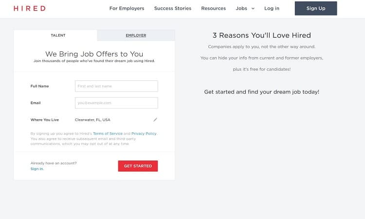
Notice the form on Hired, which includes only a user’s name, email, and a pre-detected location. More importantly, the only colorful element you see on the page is the “Get Started” button, in a bright red.
Focus on These Problems First
These problems aren’t the only ones that will bog down the experience for your users, but they are the most impactful. Focus on them first before considering some of the other ways you can optimize the landing page.
Cluttered design, poor headlines, A/B testing — they can all be dealt with after you get the foundational elements in order. Your landing page should load fast, include all pertinent information front and center, and incorporate attractive, relevant visuals. You should also keep your ask to a minimum, collecting only the information you need.
Do all this, and you should see conversions tick up and to the right.

Share on Facebook
Share on Twitter