

Zach Watson
Redesigns are often sold as all-or-nothing endeavors. Either you have the budget for the entire UX process or you don’t. But that doesn’t have to be the whole story.
At DePalma, we’ve built some flexibility into our design process so you to pick between redesigning the UX vs. the UI of your product.
But which should you choose? Ah, the eternal question. Before you can decide, you have to understand the difference between the two concepts. So let’s start by distinguishing between the two acronyms.
UX vs. UI
First, definitions. UX stands for user experience, while UI stands for user interface.
Of the two, user experience is by far the more expansive, because UX encompasses the entire range of impressions and interactions people have when they use a piece of software.
From the brand colors to the information architecture to the content, to designing personalized experiences for each user group (or persona) - everything informs the user experience. UX is often described as how interacting with a piece of technology feels.
As a discipline, UX encompasses several skill sets. There are a lot of weird infographics on the internet that try to communicate this concept, but I like this one:
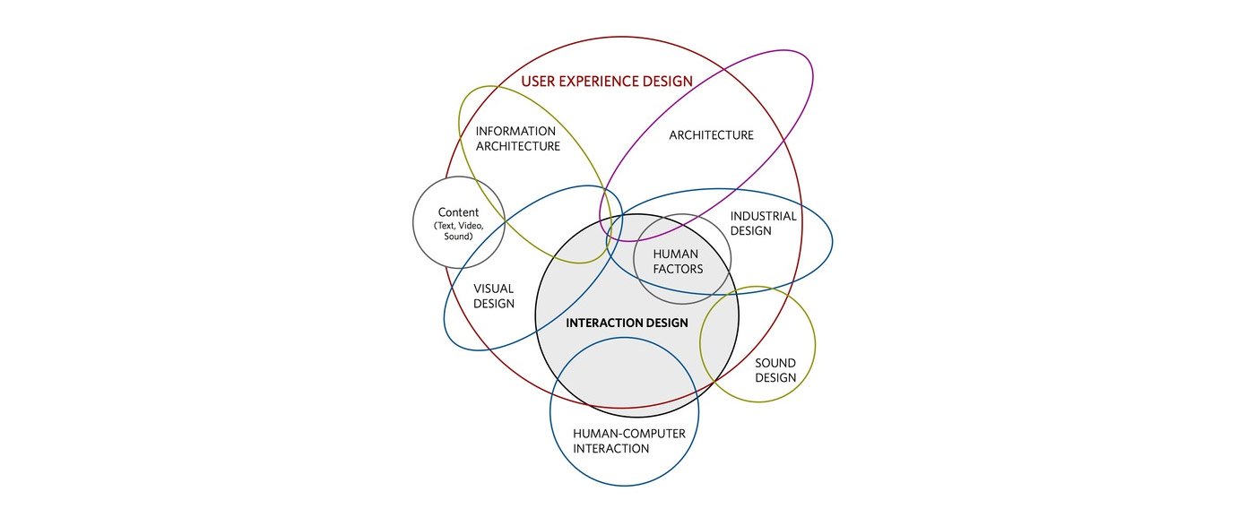
The user interface is the visual component people utilize to input and retrieve information from software. The UI design includes the layout of each screen, the order in which information appears on the screen, and other visual design principles like spacing and color.
Like the graphic shows, It’s part of the grander user experience, but only a part.
Some history
I get those definitions are pretty abstract, so let’s look at the history of these two terms for more concrete distinctions.
The term UX was famously coined by Don Norman when he was vice president of the advanced technology group at Apple.
Norman explains: “I invented the term because I thought human interface and usability were too narrow. I wanted to cover all aspects of a person’s experience with a system including industrial design, graphics, the interface, the physical interaction, and the manual.”
If you want to hear him talk more about it, here’s a video:
Earlier in his career, Norman worked for the federal government investigating the Three Mile Island nuclear accident in 1979. In an example of just how universal UX is to our modern lives, Norman concluded that the nuclear disaster was primarily a result of poor user experience design in the control room.
Somewhat less dramatically, the term user interface originates from the shortening of graphical user interface (GUI). Before personal computers, humans had to control computers through code. There were no visuals or even mice with which to navigate a screen.
But in the 1970s, Xerox PARC released a personal computer that allowed users to navigate the screen with a mouse and click images to give commands to the machine.
Here’s a look at that interface in all its glory:

(Don’t ask me to explain this image of the tiny troubadour and the giant mushroom. I can’t. )
Now that we’ve (hopefully) distinguished between UX and UI, we can return to our original question: which do you need to redesign?
It comes down to requirements. Redesigning the user experience of your product involves in-depth research into the needs, challenges, and goals of your audience. If it’s done right, the ROI will be tremendous.
However, a complete UX redesign can be resource-intensive. If you have a limited budget or just need a quick win, giving the UI a facelift can still deliver results.
What you’ll get from a UI facelift
As I mentioned earlier, user interface design deals primarily with visual design elements, so the way your product looks will change, but how it works will remain mostly unchanged.
While redesigning these elements doesn’t amount to a complete UX overhaul, it can significantly increase the usability of your software, which makes it easier for your customers to accomplish their goals.
Earlier this year, we redesigned the UI for Trievr, a task and project management system. Here are a couple of before and after shots so you can see the difference.
The task UI before was outdated. The use of color, excessive amount of content on the screen, and multiple inputs made it confusing to create a task.

So we simplified the entire interface by giving the content room to breathe, and using conventions people are more familiar with, like small, red numbers to signify updates.

And here’s the notifications UI before:

After the redesign:

The most significant difference is the layout of the screen's content and how it’s presented. All of the functionality was already built. The code was already live. We just took the UI a few steps forward to make it more intuitive based on our experience.
When clients want us to only redesign the user interface, we make our decisions based on a heuristic review — an expert’s opinion on best practices.
The idea behind a heuristic analysis was first established by Jakob Nielsen in the 1990s. In short, he said there are broad guidelines every user-friendly interface adheres to. Other frameworks for heuristic analysis have emerged since then, but the broad strokes are the same.
Here are a few conventions we use as a starting point from Nielsen’s criteria:
1) Aesthetic and minimal design
Rather than clutter up the screen with extraneous information, we design for simplicity and clarity. Most often, this means a minimalist design that emphasizes the content rather than design elements for their own sake.
2) Recognition over recall
The most usable systems are those that people intuitively understand how to use. So rather than force your audience to memorize how to interact with an interface, we strive to design functionality that’s easily recognizable to users.
3) Consistency and standards
Things have to work the same on mobile as they do on a desktop. Or at least they have to come pretty damn close. Otherwise, people are going to get confused, and your usability will suffer.
You don’t have to look too closely to notice all of these concepts at work in our UI redesign.
It’s important to remember that heuristic evaluations are opinions. Unlike the UX redesign process, the UI facelift is not supported by weeks of research. That’s why it’s less expensive and faster to do.
Now, the opinion of an experienced designer is often enough to make a huge difference, but at the end of the day, it’s just that: an opinion.
What you’ll get from a UX redesign
At its core, user experience design is evidence-based. It’s a combination of design, psychology, and engineering.
So where the UI facelift starts with the interface design, a UX redesign starts with the people who will use the product. So the first step in our human-centered design process is to find out more about your audience.
Through interviews, surveys, and other research techniques, we build personas for each segment of your customers. Like so:

This helps us hone in on the unique perspective each type of person has about your product. Then we uncover how people interact with your software now, and how we can redesign it to better match your users’ ideal version of your product.
Chief among these research techniques is observational studies, where we watch how people use your product in its current form. This helps us identify the primary tasks your users need to accomplish on a day-to-day basis and how they currently do so.
The results aren’t always pretty, and that’s okay. Developing context for the UX in its current state is critical to designing software that fits what your users are trying to accomplish.
Here’s a 2-hour workflow we identified for an enterprise client after they hired us:

This process requires navigating through 30 different screens. Of course, this is a terrible user experience, which directly impacted the productivity of anyone who had to perform this task.
After identifying the users’ current workflow, we were able to design an optimized version with just 13 screens.

You can imagine the amount of time this saved because this approach rearranges the very way in which people use software.
From there, the process enters an iterative phase. A wireframe is created for each screen in the new workflow to preview the new UI and user experience. We gather feedback from stakeholders and end-users and then adjust the design accordingly.
After multiple rounds of feedback, we then create a clickable prototype that serves as a finished demonstration of how the UX design will function before it’s coded.
This is the fundamental difference between the two approaches: one relies on the opinions of experts, while the other helps experts make choices based on research.
***
Debating the philosophical differences between UX and UI is not new for interaction designers. But the conversation takes on a new dimension when you’re deciding how to invest your resources and plan the future of your product.
In the end, this is no right answer, because every project is different. One approach is more methodical while the other delivers faster. Which sounds right for your organization?

Share on Facebook
Share on Twitter