
Zach Watson
Most people know dashboards are important. What they don’t know is how easy it is to mess up the UX design.
Dashboards are the information maps of the application era. If they aren’t built correctly, no one will be able to find what they need. Instead, they’ll spend their time shoveling through piles of data, desperately searching for the few KPIs they care about.
Productivity grinds to a halt. Alarm bells start ringing. A siren somewhere in the distance may even go off. You get the idea: it’s bad.
A dashboard’s UX goes wrong when the display information isn’t relevant to the people viewing it. This is a simple concept that’s complex to execute.
John Zavocki, a senior UX designer, provided an excellent example in his response to our State of UX Research Survey:
“Our company’s leadership wanted a dashboard that was very simple and clean. After usability testing, we found the users didn’t care if the app was simple or clean —what they wanted was access to whatever they wanted.
So a design that was cluttered to the stakeholders was more usable for the customers…”
To design a genuinely useful dashboard, you have to start with the needs of the users. You must understand their goals, pain points, and workflows and align the user experience with those requirements.
The rest of this post explains the process we use at DePalma to accomplish that.
Research before design
The entire point of a dashboard is to curate critical information and display it in a nice, neat package. As a result, the people using the dashboard have to expend less mental energy to find information and make decisions.
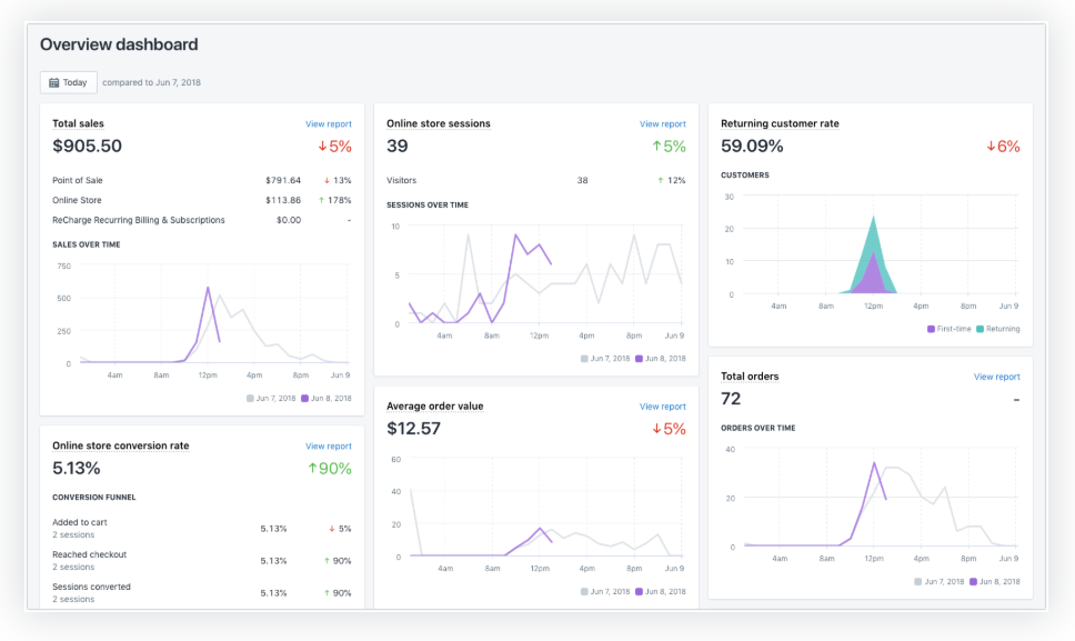 Shopify’s dashboard checks all the right boxes: making valuable KPIs easy to read, providing users the ability to drill down into the data, and keeping the visuals pleasingly minimalistic.
Of course, the idea of important information is relative.
The chief technology officer doesn’t have much use for the click-through rates of the latest Adwords campaign, while the success of the demand generation manager is defined by those numbers.
So before you design a single thing, you need to understand what information your audience wants. That means knowing the goals your users are trying to achieve and the series of steps they take to accomplish them.
That’s why we always start with research.
Sometimes we learn about the audience through a workshop, where we interview users and stakeholders. In other projects, we travel to the client’s office and observe how users work firsthand.
 Most businesses don’t consider workflows from the users’ perspective. Our workshops help stakeholders see the needs and challenges their audience faces in their work, maybe for the first time.
There are a variety of ways to conduct user research, so pick the right techniques to match the requirements of each project. If you want to take a closer look, check out this step-by-step tour of our UX design process.
Regardless of how we do it, the research yields key insights that guide how we design the application:
-
The primary personas who will utilize the software
-
The needs, pain points, interests, and goals of each persona
-
The workflows used to achieve their goals
Here’s how each of these areas helps build a more intuitive dashboard:
Personas
.png?width=1268&name=Screenshot%202018-08-02%20at%202.17.10%20PM%20(1).png)
Making a dashboard relevant means personalizing the data it shows. It would be insane to try and personalize data on a one-to-one basis, so we need a shared signifier that allows us to determine which information is most relevant to each user.
That signifier is a persona, typically separated by job function (at least in B2B).
Rather than use personas as a repository for mildly useful demographic information, we use them to develop cognitive empathy with end-users —that is, to better understand their work from their perspective.
With that context, we can personalize dashboards on a persona level, aligning the UX design to the exact problems that are most important for each person.
Needs, interests, pain points, and goals
Making personas actionable means tying them to data that informs design decisions. Through interviews, surveys, and observational research, we build a body of qualitative and quantitative data about what users need to achieve and why.
This could be broken down into a couple of classifications:
-
Needs: the functions, data, and results users require from the system
-
Technical skills: the degree of sophistication users bring to the application
-
Enjoyment: the things people enjoy about their work
-
Pain points: the factors, whether technological or organizational, that prevent the users from accomplishing their work
-
Goals: the finish line, what each persona needs to get done in the application
The work lives of humans are every bit as complex as their personal lives. Comprehending the minutiae that pervades each persona’s daily workflow can have a substantial impact on the experience design.
For example, if we’re designing a dashboard for a consultant who’s often out of the office, we have to make sure the mobile version offers them all of the functionality they need.
Or when we designed an application for riverboat captains (yes, that happened) we knew they had to keep their eyes on the river as well as use the application. We made the buttons massive so they couldn’t miss them.
Workflows
People don’t like to think about it, but most of their work happens as a repeating series of tasks. These are what we call workflows.
By speaking directly with users and stakeholders, or by observing users at work, we document each step in each workflow (which differs from persona to persona) and visualize the most important patterns.
After mapping the totality of the user’s workflows, we can design the dashboard to prioritize the next step for the most important tasks, saving everyone tremendous mental energy by making every task more intuitive.
It’s difficult to emphasize just how important it is to do your homework before doing any design.
So I’ll give you another example instead.
Here’s our very own Scott Carothers describing a dashboard project he worked on:
“We (the business) assumed that users of an application wanted to see certain metrics that our users ultimately cared very little about. So we conducted over 10 user interviews to uncover the meat of what our users wanted to see.
A piece of the design that was an afterthought later became the metric that was the centerpiece for the second iteration of the dashboard.”
Creating the Dashboard UX
UX design is a blend of science, engineering, and art. The research we’ve done heavily informs the structure of the dashboard, but it’s down to our designers to interpret that information and create an interface and experience that satisfies the audience’s biggest requirements.
Thankfully, they aren’t flying blind. There are several established UX principles we use to organize the design based on recognized patterns of human behavior. This is also an area where experience and talent make a significant difference.
Here are a few best practices we follow in the visual design stage:
Insight at a glance
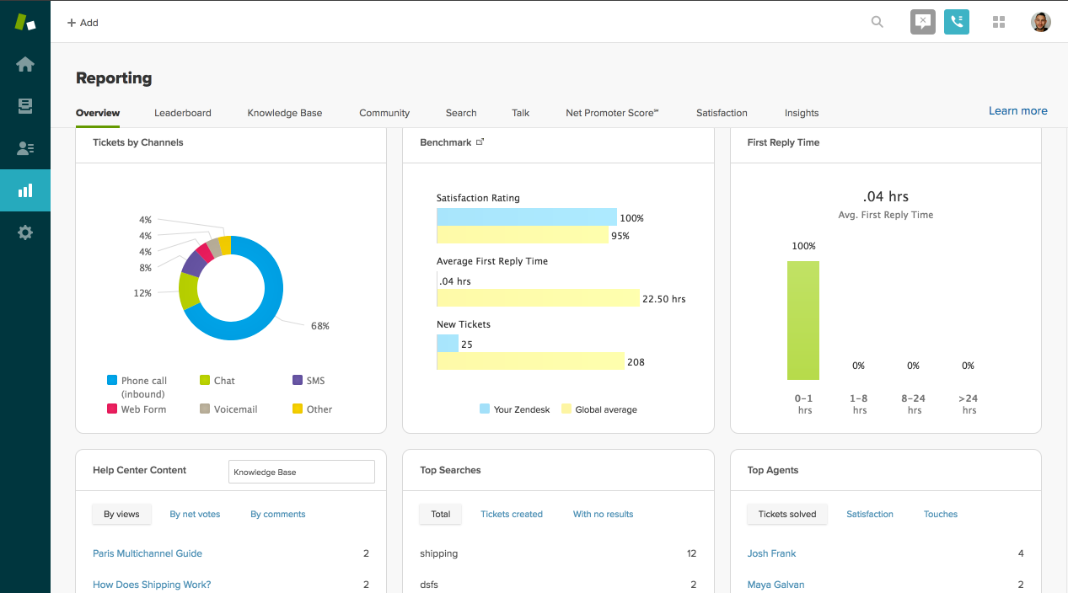
Zendesk’s dashboard is dead simple and very useful. The key metrics for customer service reps are displayed in easy-to-read formats without feeling overwhelming.
Everyone has a finite reservoir of mental energy. The more complex a task is, the more it saps our energy reserves.
A well-designed dashboard should provide users with valuable information as soon as they open it up. Just by glancing across a few graphs, users should be able to ascertain what’s happening with their most important projects so they can formulate their next move.
At the same time, there needs to be restraint in the amount of display information. If the screen is a smorgasbord of data —even valuable data — users will lose the experience of easy insight, and the dashboard just won’t be as efficient.
This concept also applies to matching the right visualization to the right data. It’s all too easy to have exactly what the user wants to see in a format they can’t quickly understand.
Usability through aesthetics
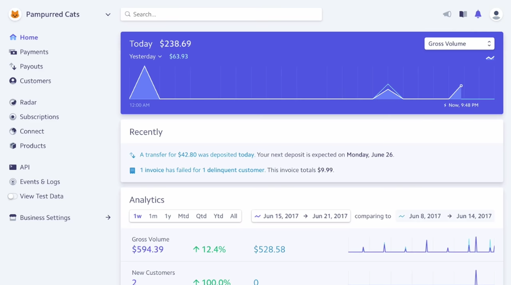
Stripe’s dashboard goes heavy on the aesthetics, which makes it a marvel to look at, and a joy to use.
Humans prefer attractive things, technology included. We have such a strong preference for beauty we subconsciously assume technology that’s pretty is easier to use —even if it’s not.
This psychological principle is aptly named the aesthetic usability effect, and it encapsulates why spending time on fonts, colors, visual hierarchy, and all the other factors of visual design are so important.
Turns out, if you make a dashboard easy on the eyes, people are more likely to enjoy it.
Supporting the next step
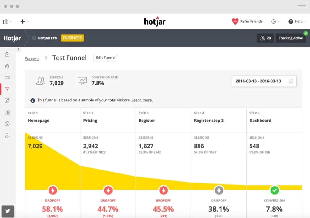
Hotjar’s dashboard makes it clear what users can do next: edit the funnel, learn more, or change the date to see different data.
Designing a pretty information display will only get you so far. People will tolerate minor user experience flaws in the name of beauty, but they won’t sit quietly if the dashboard doesn’t make their job easier.
Using what we know about the workflow of each persona, we always design dashboards as an entry point to more complex tasks.
So if the users need to drill down into a certain piece of data, that’s one click away. Or if there’s a common workflow that involves multiple steps off the dashboard, we make sure the next step in that process is apparent.
***
The trifecta of a UX design tailored to the needs of each persona, aesthetically pleasing visual design, and just enough of the right information form the three pillars of every good dashboard.
It’s tempting to start in the visual design phase, but we all know only fools rush in. Without knowing what each segment of your audience needs, you can’t build the kind of dashboard that will help them.

Share on Facebook
Share on Twitter