
Aleks Peterson
There’s a popular story about one of the first audiences to see a motion picture — a group of French viewers who watched a 50-second clip at a small theater in Paris in 1896.
As the tale is often told, they watched in awe as a silent train approached a station from a distance, getting closer and closer to the screen and seeming at the last moment to burst from the bottom-left corner into reality. With no frame of reference for this miraculous illusion, they ran from the theater in terror.
It’s a powerful example of the cognitive transformation a medium can deliver by combining the visual, spatial, and temporal.
Except, it’s not true.
Arrival of a Train at La Ciotat was one of 1,400+ short, staged “documentaries” created by Auguste and Louis Lumière, many of which the public had already seen, and there are no credible accounts of theater hysteria. In all likelihood, this was nothing more than an urban legend spun to heighten the mystique of early cinema.
So maybe the myth of La Ciotat is more an example of the gap between expectation and experience, left unfilled by an artistic decision that was more gimmick than revelation. It’s easy for this to happen in UX design, too, especially when it comes to animation.
We want our UIs to be interactive and eye-catching, but we don’t always understand the principles that make animation and visual feedback effective. How do you render motion intuitively—in a way that supports user interaction, rather than distracting from it?
It’s not enough to see a train approaching and exiting the screen and some grainy people milling around on a platform. Your users need to know why that’s happening and where the train is going . . . without having to think about it.
The Fundamentals of UI Animations
Despite what many skeptical designers may think, animation is much more elevated than making stuff move (just as design itself is more elevated than “making things pretty”).
Animation is about enhancing overall usability by turning design states into actions — think about a static mockup of an object that looks three-dimensional, vs. watching a two-dimensional object pivot in a way that helps the users understand the larger spatial framework.
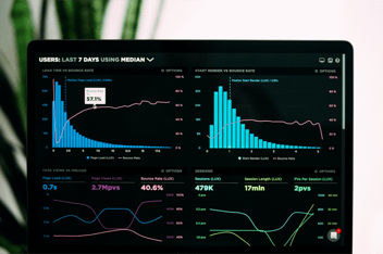
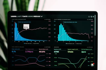
CREDIT: Flipboard
Animation can either happen in real-time (immediately, as the user interacts with a component) or asynchronously (in response to user input or action, usually as a transition).
Neither type is “better,” of course, but you should evaluate every spatial and temporal technique against a set of user-oriented standards to determine its merit.
Are you grasping at the straws of “delight,” or adding tangible value? Are you serving the user, or serving creative whimsy?
UX in Motion founder Issara Willenskomer lays out four pillars in his manifesto:
-
Expectation: how something behaves compared with how the user perceives it — this gap should be as small as possible.
-
Continuity: the consistency and cohesion of the experience as it flows between scenes and as it exists within a scene.
-
Narrative: the idea that individual events and movements should join to tell an overarching story.
-
Relationship: the connections between UI objects that help users process information and make decisions
In theory, you should be satisfying at least a couple of these principles every time you add a motion-based element. One of the most essential and practical forms animation takes in UX design is visual feedback.
Visual feedback is an interactive tool to make the user feel more in control. Nick Babich, describes this idea well when he says visual feedback “acknowledges that the app has received a user’s action” and “communicates the results of interaction, making it both visible and understandable.”
This could be as simple as a button reacting to a click, or as sophisticated as an entire visual scene swiping in as the user scrolls.

SOURCE: https://uimovement.com/ui/5631/add-to-cart/
Given the breadth of resources available for today’s designers and developers, there's no excuse for creating interactive elements without visual feedback. In many ways, that's what separates intuitive modern design from the lifeless, static pages of the 90s we all love to lampoon.

CREDIT: Justinmind https://www.justinmind.com/blog/10-90s-websites-designs-you-wont-believe-existed/
Making Motion More than a Gimmick
Maybe your aim isn’t to send people screaming out of a theater, but you still want your designs to be impactful. Even following Willenskomer’s four (very abstruse) principles, it’s still possible to turn out a poor product.
To distill things down to a more tactical level, here are three best practices that will help you create winning designs with motion:
1. Bake it in at the prototype stage
Just because you’re adding a temporal dimension to your project doesn’t mean the work should happen in a silo, outside of a tried and true prototyping process.
As we’ve suggested in the past, working with clickable prototypes as early as possible can save you from unnecessary re-work in the long run. Whether you’re pitching investors, showing a demo to a product manager, or running usability tests, any animations you want to incorporate should be part of the picture.
2. Obsess over timing
Because timing is everything. Animations that are too fast, too slow, or disjointed will create cognitive dissonance. The user will suddenly become aware that they are waiting for something to load or that they are merely a spectator to a half-baked performance.
The animation principle of “easing” should be worked into the fabric of every animation your app or UI employs. Disney calls this “slow in slow out.” Think about a car accelerating — you don't leap from zero to 60 mph instantaneously. No one would want to drive that car. But you also don't take 5 minutes to go from 0 to 60.
In this example, you can see how the navigation between frames is gentle at the beginning and end, but faster in the middle (vs. linearly sliding between scenes). SOURCE: https://www.behance.net/gallery/67817393/20-Excellent-UIUX-Design-Animation-Examples
3. Make it invisible
There are ways to render animation that draw more attention to the animation itself than to the decision you want them to make or the information you want them to retain.
On the other hand, if you're doing it right, the user will barely notice.
That doesn't necessarily mean your animations have to be imperceptible, but it does call for subtlety. And the measure of subtlety, again, is the distance between expectation and experience.
If the motion you employ does not perfectly align with the user's expectation for how something should behave, the spell will be broken, and the user will feel less connected to your product.
***
There are a thousand different schools of thought from UX leaders about the core doctrine of animation. It's easy to get tangled up in theory by trying to honor all of these different rules but still design a poor experience.
At the end of the day, just ask a couple of simple questions about what you’re building. Does it feel natural? Does it add value to the user experience, and what is that value?

Share on Facebook
Share on Twitter