
Zach Watson
UX design is a many-splendored thing. From user flows to empathy maps to information architecture, there are many considerations. Chief among them is content, which is the centerpiece of the user experience.
Yet one of the most important types of content is frequently overlooked. Residing on buttons and forms is microcopy, the short, instructional phrases that guide us through experiences online.
Though they may be inconspicuous, these small arrangements of words are fundamental to intuitive design.
Google’s UX writing team provides a perfect example. The design for hotel search originally displayed a copy that read “book a room,” when people searched for places to stay.
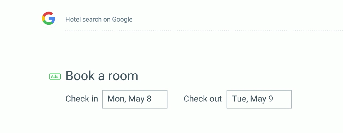
After some testing, the content strategists at Google inferred this copy asked too much at this point in the user journey. Most people were just window shopping. They weren’t ready to book anything.
So they changed the CTA to read “Check Availability,” which reduced anxiety and clarified what would happen next. Engagement spiked by 17%.
Given the volume of hotel searches on Google, the impact of changing two words of microcopy was massive.
Good microcopy anticipates the questions and anxieties people experience throughout their user flow and provides vital information to alleviate their concerns. Look closely, and you’ll find similar tiny text planted in all the best digital products today.
The rest of this article explores why, exactly, microcopy carries so much influence and when it’s most important to use it in your UX design.
Why do people love microcopy?
Because we need context
Humans are visual creatures. Anyone who blurts out “I’m a visual person!” is just affirming that they are indeed a normal human.
Vision plays a fundamental role in how we interpret our surroundings. Rather than just relaying what our eyes see, vision acts as a type of reasoning. Our brains interpret the images our eyes send to establish context and understanding of our environments.
Of course, the primary function of UX design is to help the human mind more easily establish an understanding of how to use something. For this lofty goal, designers use affordances, or indicators of how interactive elements should be used.
Icons, colors, and patterns are both tools that can be used as affordances, but language, i.e., copy, is the most powerful option.
Consider these buttons. The contrasting color and shape give you an indication that you could interact with these elements. But one of these is not like the other.
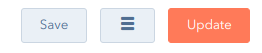
It’s clear what the two buttons with copy do. I know what to expect. But I have no idea what the hamburger menu in the middle does, so I don’t know when to use it.
Because we have standards
You’ve heard it before, and you’re about to hear it again: a cadre of pioneering organizations have raised the bar for what we expect from our interactions with digital and physical products.
If you need a hint, I’m talking about Apple, Amazon, Airbnb, Uber, et al. Once someone interacts with one of these products, their definition of good usability changes.
This phenomenon is called liquid expectations, where our experiences with one application reshape our standards for every experience that follows.

I measure everything in life against how easy it is to book a room on Airbnb. Every word on this page is crystal clear. Confusion does not exist in this realm.
UX design is an optimization arms race, and you can be sure the best experiences come complete with grade-A microcopy.
Like Google found out from their hotel search test, UX pioneers know how powerful microcopy can be. So they optimize it relentlessly, and we all love it. And when we stumble on a UX design that’s unclear — that say, doesn’t have helpful microcopy — we grow confused and lose our patience.
3 important use cases
It’s all well and good to know why microcopy is a thing, but it’s even better to see it in action, right?
Since nearly every digital interaction includes text of some kind, there are a lot of ways to put microcopy to work. I won’t bore you with privacy policies or GDRP notifications — not only because they’re not interesting, but because they just aren’t your biggest priority.
Here are three scenarios where microcopy makes or breaks your UX design:
1. When you need to alleviate concern
Our daily interaction with technology is full of uncertainty. And when there’s uncertainty, people stop cold and abandon what they’re doing.
Of course, that’s not what you want, but you also can’t address all uncertainty with design alone. This is where good microcopy can skyrocket your conversion rates and deliver significant value to your organization.
When entering information into a form, people often feel nervous that their first choice will remain their eternal choice. They’re scared their decision will be irreversible, and they’ll be cursed with buyer’s remorse.
Nowhere is this emotion felt more strongly than on e-commerce purchase screens. “What if this stormtrooper onesie doesn’t fit? Can I return it?”
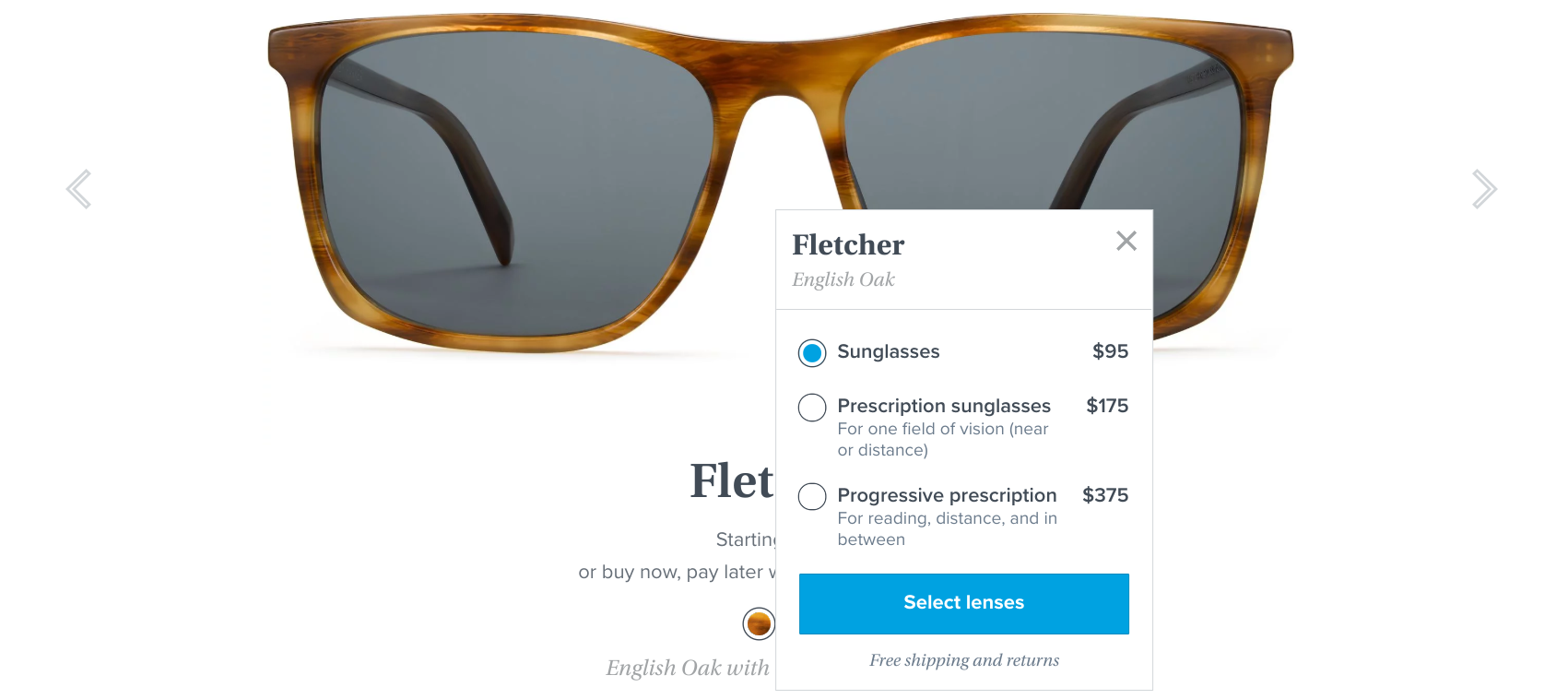
Warby Parker allays these fears with just four words: “free shipping and returns.”
The simplicity of that message is beautiful, but the message itself is also powerful. This microcopy is guaranteeing the shopper has full control over the process. If the sunglasses don’t fit, just return them at no cost, the case is closed.
Another common concern is the fear of unwanted communication.
Convincing people to sign up to receive more information from you is the most effective way to retain customers. But people (rightly) worry that marketers will abuse the right to contact them. Your microcopy needs to convince them otherwise.
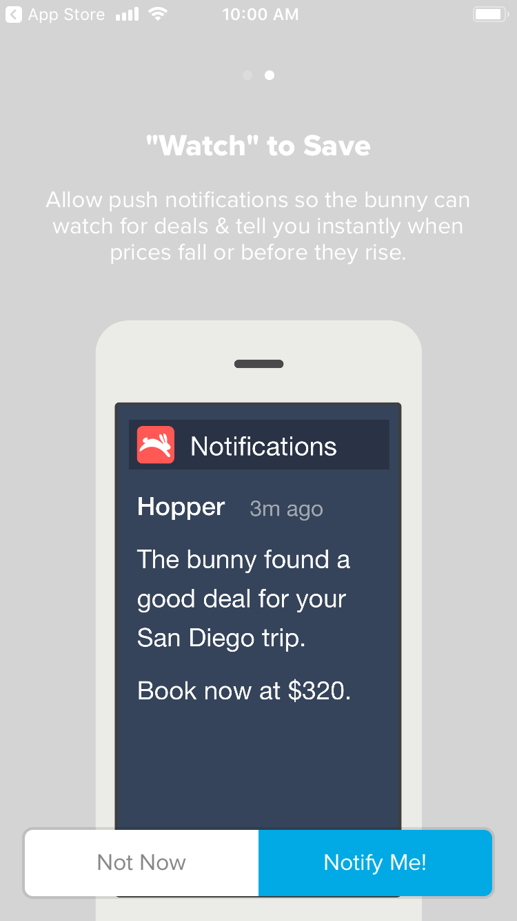
Hopper, an app that recommends the best time to book flights and hotels, needs people to sign up to get push notifications. Otherwise, the app doesn’t work.
So, Hopper uses microcopy in their onboarding to show exactly what kind of information they’ll be sending you. Once that’s clear, opting in for notifications feels a lot less risky and a lot more logical.
2. When you need to provide guidance
Humans can only burn a certain amount of attention each day, so we prefer when the next move is obvious.
Yet even if a design is dead simple, you can be sure people will need guidance at some point. Users rarely interact with a design the way its creator envisioned, so microcopy must act as a guardrails to help prevent people from completely losing their way.
Blank text boxes rank among the most intimidating and confusing interactions. Whether it’s a search bar or an answer box, people often need direction on what words to use.
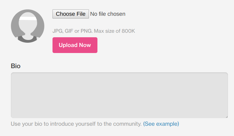
When you sign up for Dribbble, you’re prompted to create a short bio. This is a pretty hefty request because people are always anxious about how they describe themselves, even more, when they need to do so in a few words.
Microcopy to the rescue. By clicking “See example,” you can pull up a stock bio from Dribbble’s cofounder.

There’s even a copy above the example that gives you a model to follow. Instead of filling an infinite blank space with words, writing a bio seems like a much more straightforward endeavor.
Error pages are another important use case. When someone veers off the road of your sitemap, they need to be greeted by a billboard that (a) doesn’t make them feel dumb, and (b) gently guides them back to the main highway.
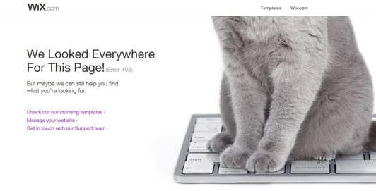
By using “we” as the subject of the headline sentence, Wix does a good job of taking the blame off the user. Then they offer a few examples of what users might be looking for, so they don’t have to figure it out for themselves.
Wix even throws in a huge, gray cat for good measure.
3. When you need to set expectations
Modern life is hectic. People have less time (or believe they have less time) in their day for lollygags than at any other time in history.
So before they commit to a multi-step interaction, humans need to know how long it will take. In practical terms that means you need to set their expectations.
Getting a free insurance quote from Oscar Health is a perfect example:
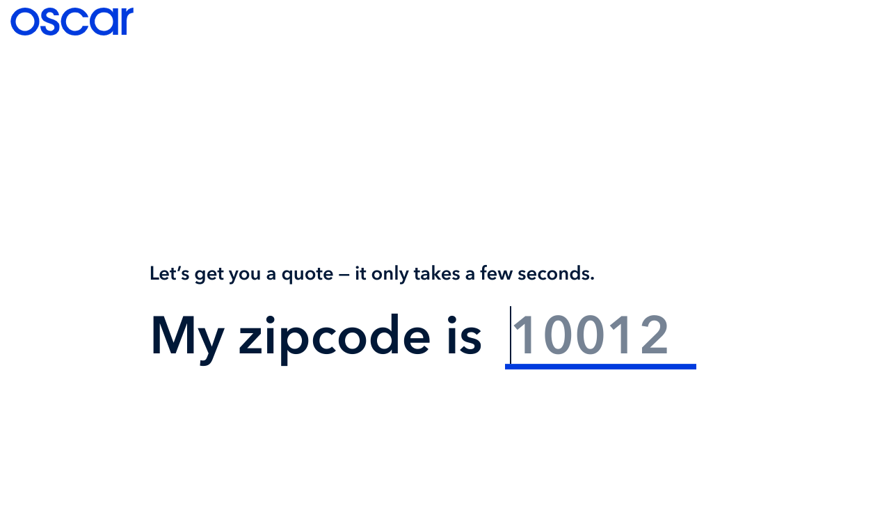
Insurance never sounds easy, so the very idea of getting a quote, free or otherwise, conjures images of long phone calls and complex questions. Solid reasons not to move forward.
This copy addresses those concerns head-on by promising the whole ordeal will only take a few seconds.
Whether it’s a product, a ride, or food, we also need to set expectations when we order something.
Uber Eats does a nice job of combining visual design with microcopy to precisely answer those all-important questions: “What’s happening with my food and when will it be here?”
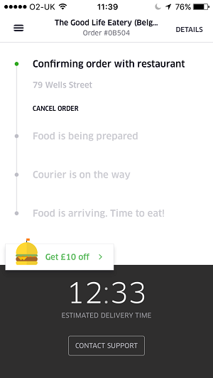 Image Credit
***
Design is a unique facet of human nature —both in the complexity of the things we design and the lengths we go to ensure they’re usable.
But another, perhaps even more defining, characteristic of humans is language. So any design that strives to be intuitive must include clear words of instruction. Other elements of UX design may enjoy more of the spotlight, but microcopy keeps the show going.
Share on Facebook
Share on Twitter