


Tatiana Pupko
This post will explore the art of organizing Figma files to optimize collaboration between designers and developers.
Organizing Figma Files
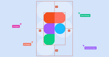
Effective collaboration begins with well-organized Figma files. Think of your Figma workspace as a shared canvas, and just as artists arrange their tools and paint meticulously, designers should organize their files systematically. We'll delve into the importance of keeping your Figma files clean and orderly. Learn how proper file organization can save time, reduce confusion, and enhance collaboration.
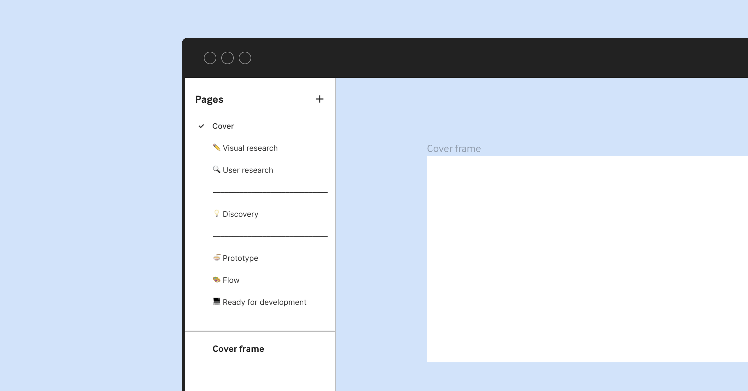
Consider creating separate pages or frames for different project sections when structuring your Figma files. This helps maintain a clear hierarchy and ensures that various design elements are logically organized. Use meaningful names for pages and frames, making navigating the project easy for designers and developers.
Additionally, you can group related design elements within frames or use Figma's auto-layout feature to maintain consistency in spacing and alignment. Properly organized layers and groups contribute to a more efficient design process and facilitate a seamless handoff to developers.
Naming Conventions
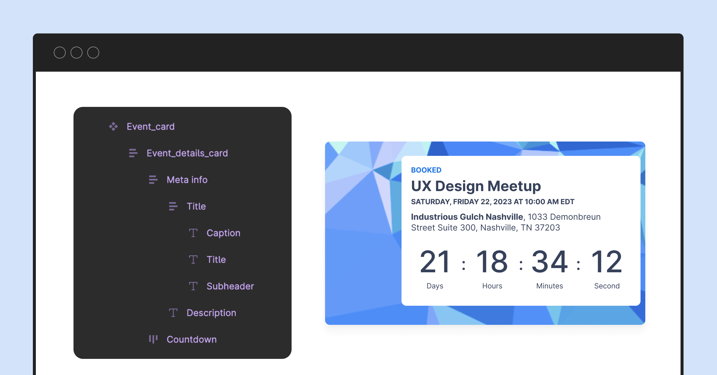
Clear communication is at the heart of collaboration. When designers use consistent and descriptive naming conventions for layers, frames, and components in Figma, developers can quickly understand and work with the design assets. Discover the significance of naming conventions and how they can bridge the language gap between design and development teams.
When naming layers and components, opt for names that convey their purpose or function. For example, instead of naming a layer "Rectangle 1," use a name like "Header Background" to indicate its role in the design. Consistency in naming simplifies the developer's workflow and reduces the chances of misinterpretation.
Figma allows you to rename layers and components easily, so take advantage of this feature to maintain a well-structured and intuitive design file.
Using Components & Variants
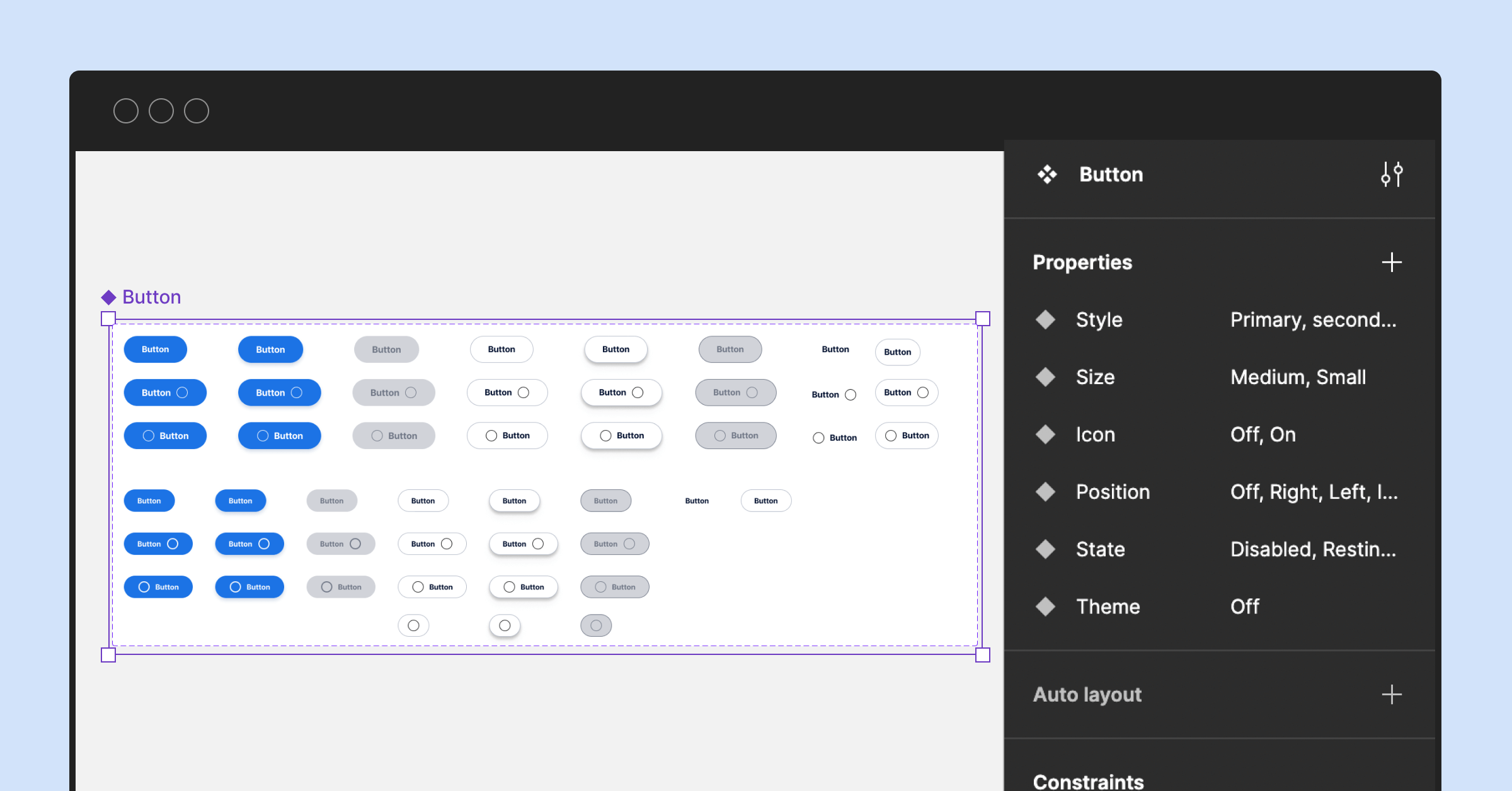
Figma's components and variants are powerful tools for maintaining design consistency and streamlining development. We'll show you how to harness these features to create reusable design elements that simplify the developer's workflow. Learn how components and variants can ensure your designs stay cohesive across various screens and interfaces.
Components are design elements that can be reused and customized across your project. For instance, you can create a button component with different states (e.g., normal, hover, and active) and reuse it consistently throughout your design. This saves time and ensures that your design maintains a uniform look and feel.
Variants, on the other hand, allow you to create variations of a component. For example, you can have a button component with variants for different sizes or styles. Variants enable designers to maintain design consistency while accommodating various design requirements.
By utilizing components and variants effectively, designers can create design systems that make it easier for developers to implement the design in code. This streamlines the handoff process and reduces the likelihood of design inconsistencies.
Color & Typography Styles
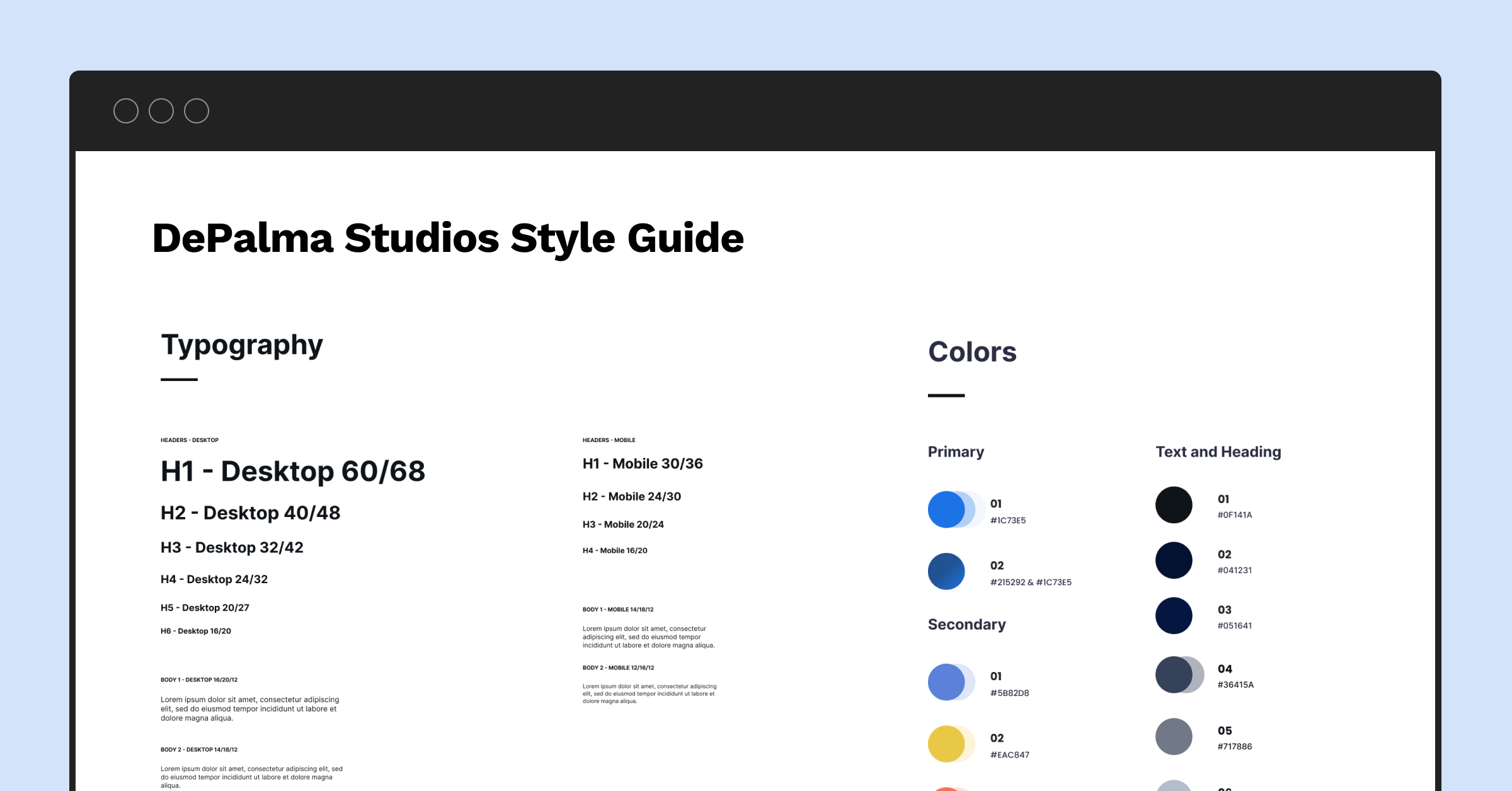
Every design project needs a style guide that defines colors, typography, and other visual elements. Figma allows you to establish standardized styles that developers can readily reference. Discover how to create and maintain color and typography styles within Figma to ensure that your designs adhere to your brand's identity and principles.
Consider creating a dedicated "Styles" page in your Figma file to maintain consistent colors and typography throughout your design. This page can house predefined color swatches, text styles, and any other design-related styles. By using these styles consistently, designers and developers can ensure that the final product aligns with the intended design aesthetics.
Figma's styles are not static; they can be updated globally, ensuring that color or font style changes are reflected consistently across the entire design. This feature simplifies the design iteration and adaptation process and the implementation of design changes in the development phase.
Structured Figma files are the backbone of successful collaboration. They serve as a common language between designers and developers, ensuring everyone is on the same page. Whether you're a designer aiming to optimize your workflow or a developer looking to understand better design assets, Part 2 of our series equips you with the knowledge to structure your Figma files effectively.
Stay tuned for our next installment, Part 3, where we'll dive into best practices for collaboration within Figma. We'll explore techniques for effective communication, annotation, and collaborative workshops that will further bridge the gap between design and development teams.
Navigating the Figma Developer Handoff Landscape
Journey through the multifaceted world of Figma handoffs with our handpicked articles. Whether you're keen on unraveling the nuances of design and development, eager to master the art of effective communication, or seeking a thorough guide on the handoff process, these reads have been curated to elevate your understanding and collaboration efforts. Immerse yourself and optimize your Figma handoff approach.
-
Mastering the Figma Developer Handoff: Dive into design, development, Figma's rise, and collaboration tips. Embark on an enlightening journey.
-
Figma Developer Handoff Best Practices: Explore techniques for effective communication within Figma, including annotations, comments, and collaborative workshops.
-
Figma Developer Handoff Step-by-Step: Discover the crucial steps in the handoff process, from exporting assets to providing detailed documentation.
Share on Facebook
Share on Twitter


